Redesigning network performance analytics and print reporting for enterprise clients.
Bruin (owned by MetTel) is an enterprise communications platform providing voice and data network management. In mid-2023, Bruin partnered with Fidelity National Information Services (FIS), a Fortune 500 company with 53,000 employees, to deploy cutting-edge SD-WAN and PIAB devices across their global sites. While the underlying network technology was state-of-the-art, Bruin lacked the visual tools to demonstrate service performance and value directly to client executives. In a 4-month engagement, we designed a centralized web dashboard and print-ready reports that transformed raw database metrics into a persuasive narrative of reliability, proving why clients should favor Bruin.
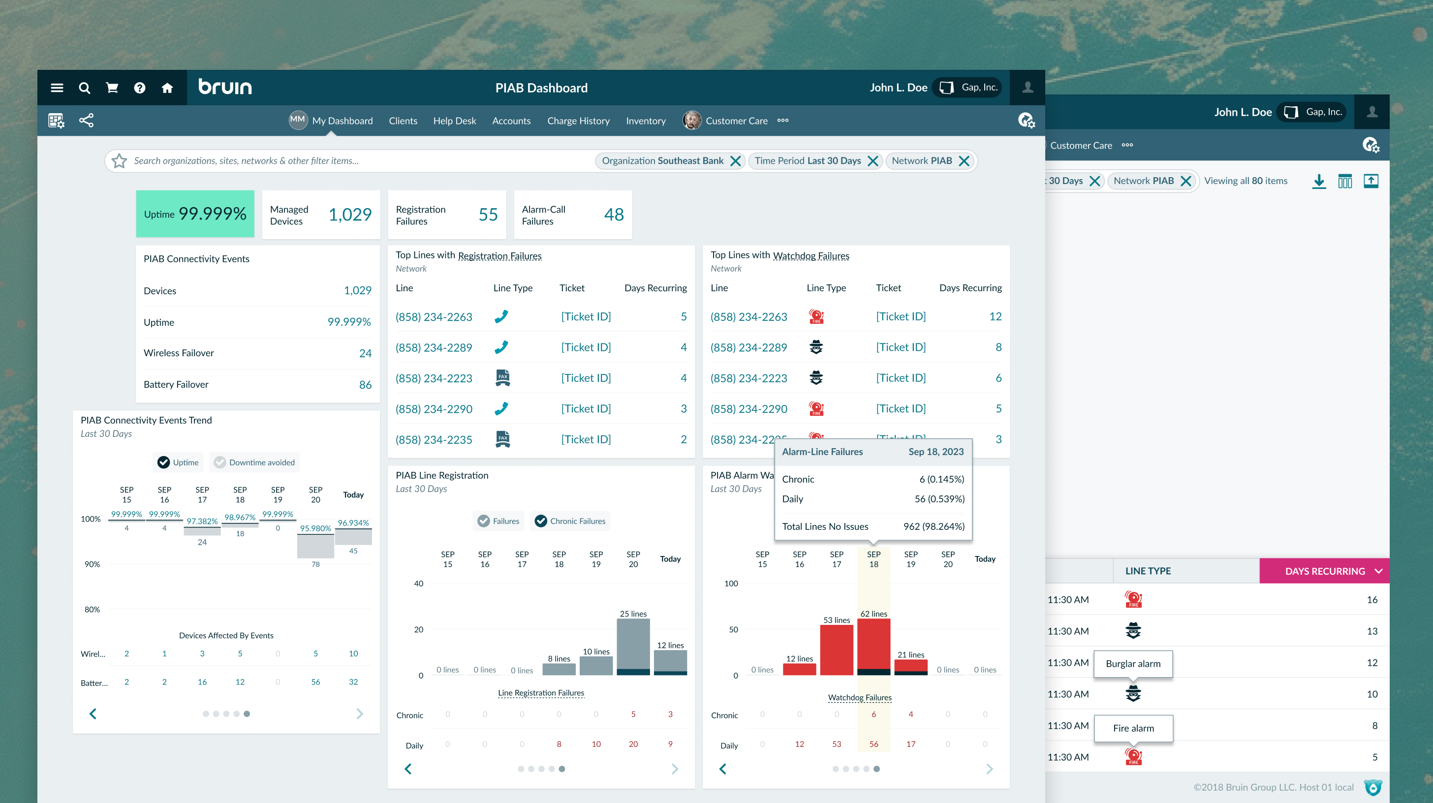
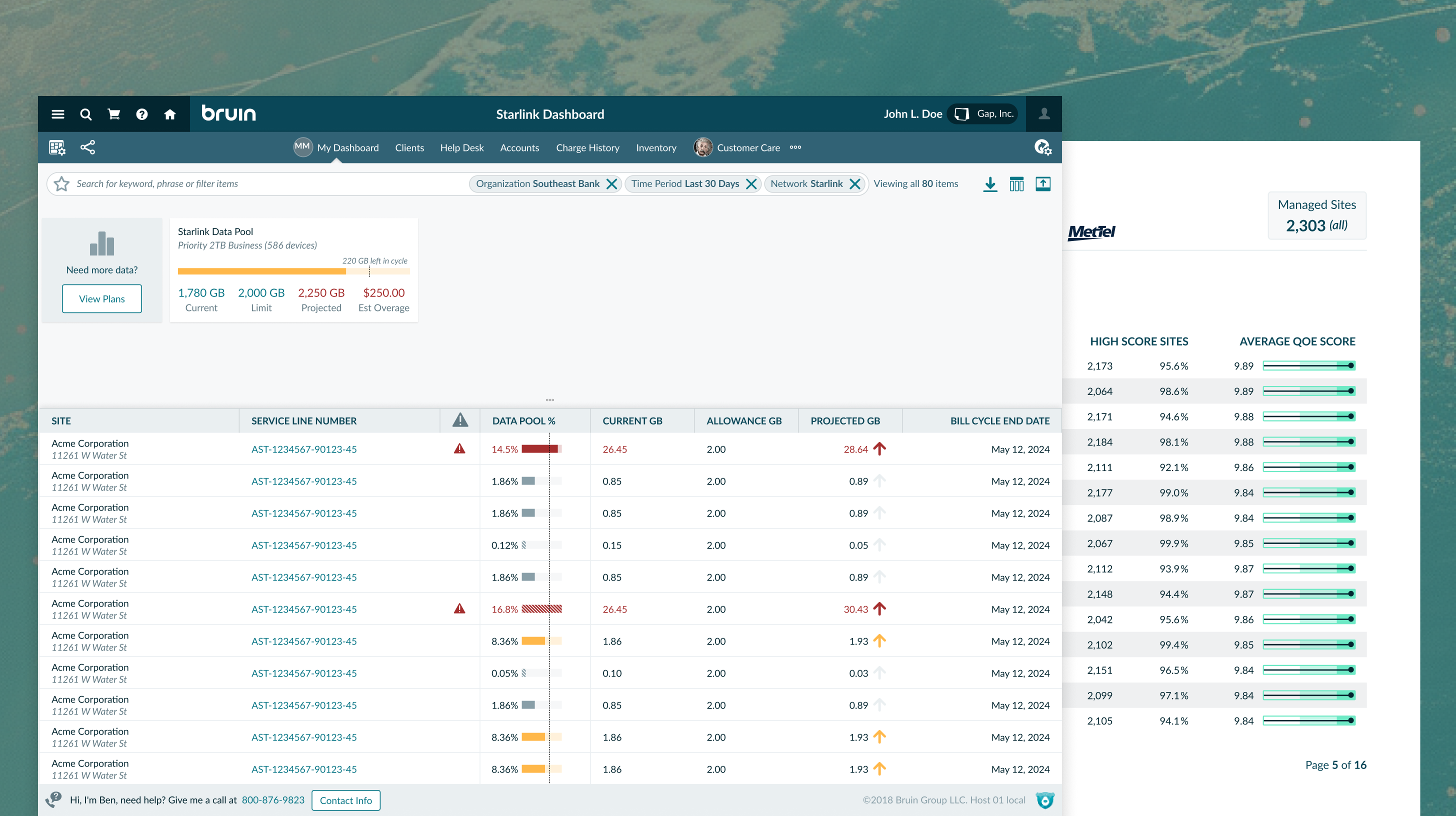
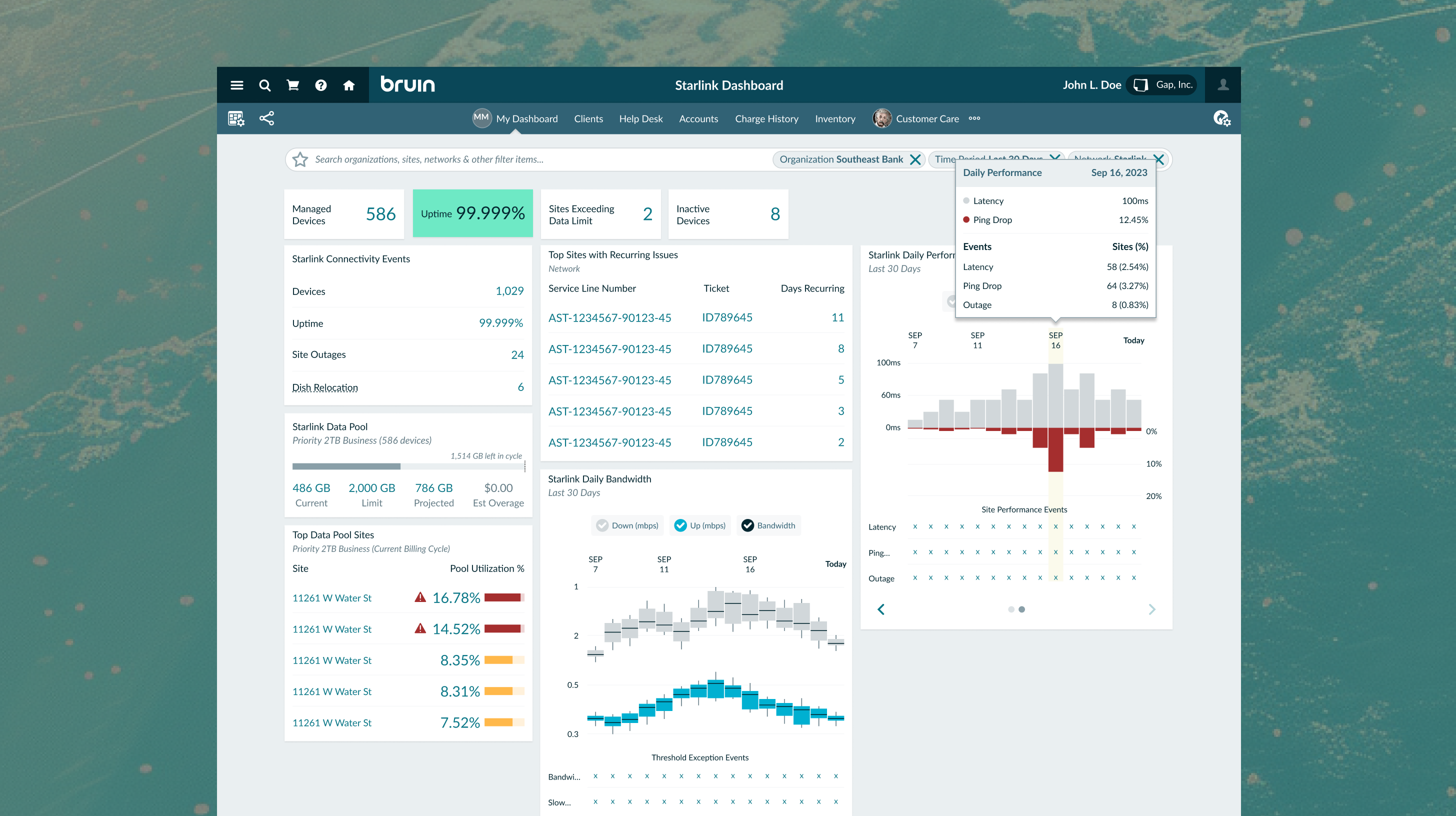
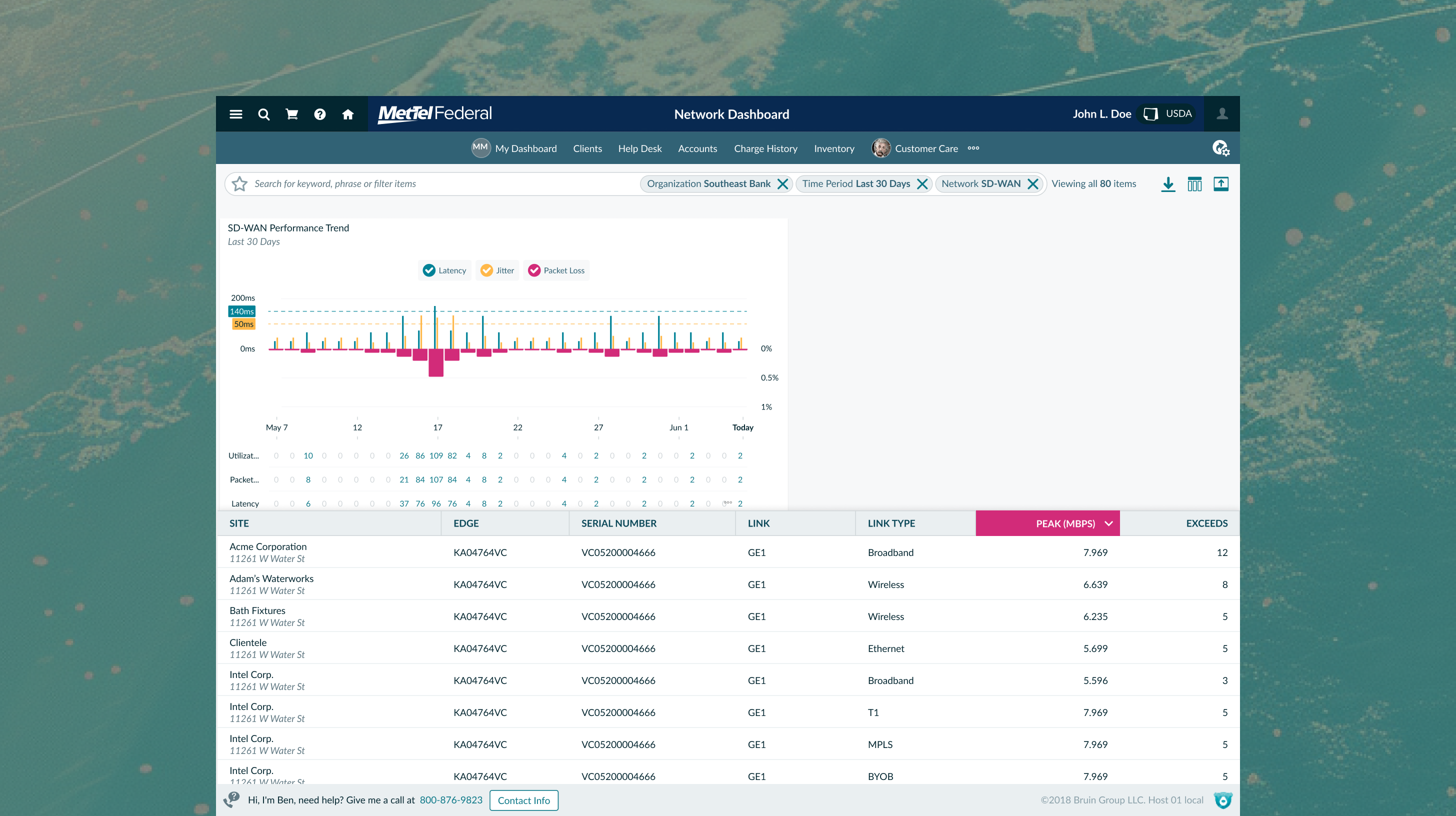
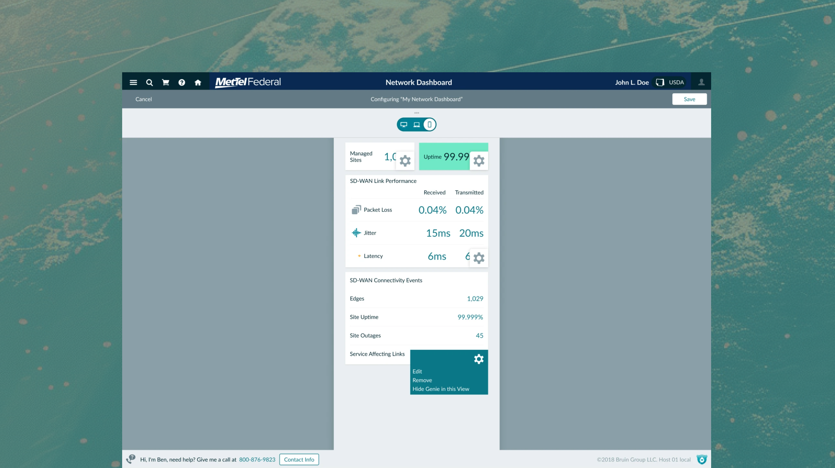
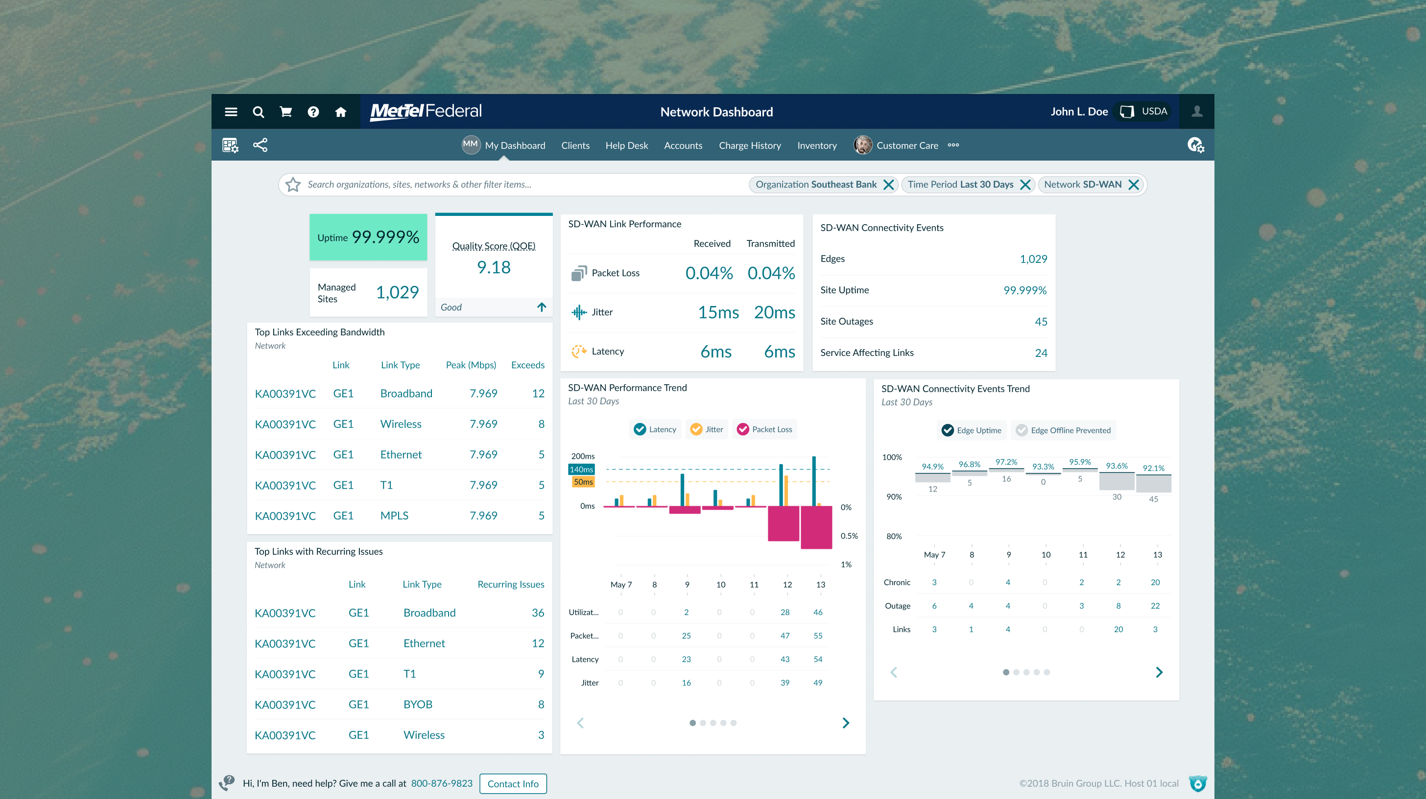
MetTel’s enterprise clients needed a clear, unified view of their voice and network device status. We designed centralized reporting dashboards on the Bruin platform for SD-WAN, PIAB, and Starlink devices, translating complex network health signals into business-level insights.
Despite upgrading to cutting-edge networks, clients like FIS could not easily track bandwidth consumption, quality of experience, or uptime. This visual deficit meant business executives could not prove SLA compliance during client reports, threatening customer trust in Bruin's capabilities.
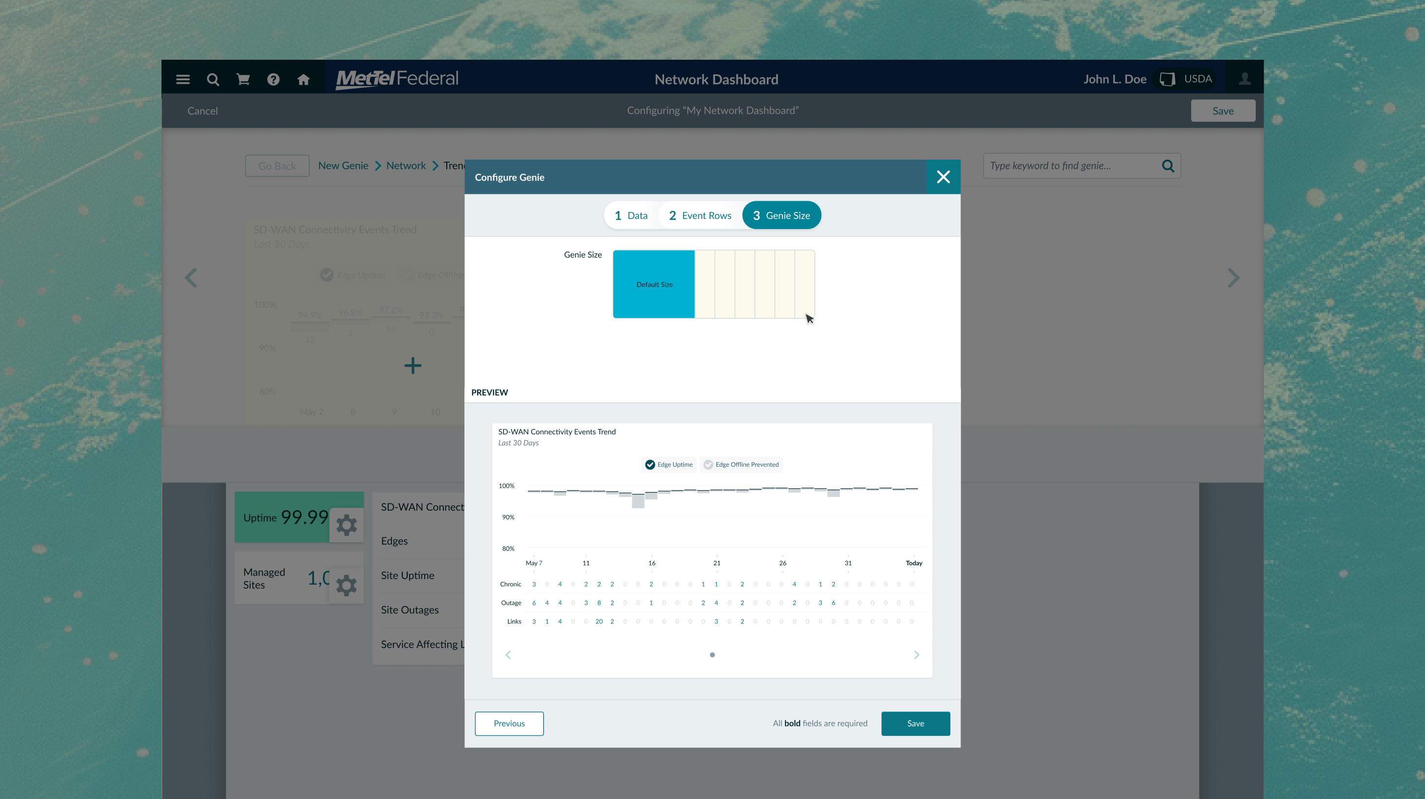
The design system had to support live, interactive dashboard monitors as well as static, black-and-white printed reports. Translating tooltips and interactive charts into static paper layouts introduced unique readability and educational constraints.
Stakeholder discussions revealed that data visualizations are powerful in consumer report meetings. They assist business executives in effectively illustrating Bruin's SLA compliance, enabling them to craft compelling narratives about Bruin's performance capabilities.
It became evident that customers prioritized insight into network device uptime, quality of experience, issues, bandwidth usage, and costs per MB.
Stakeholders noted that customers often have to utilize their third-party device platforms to track their network reports, and the availability of data analytics.
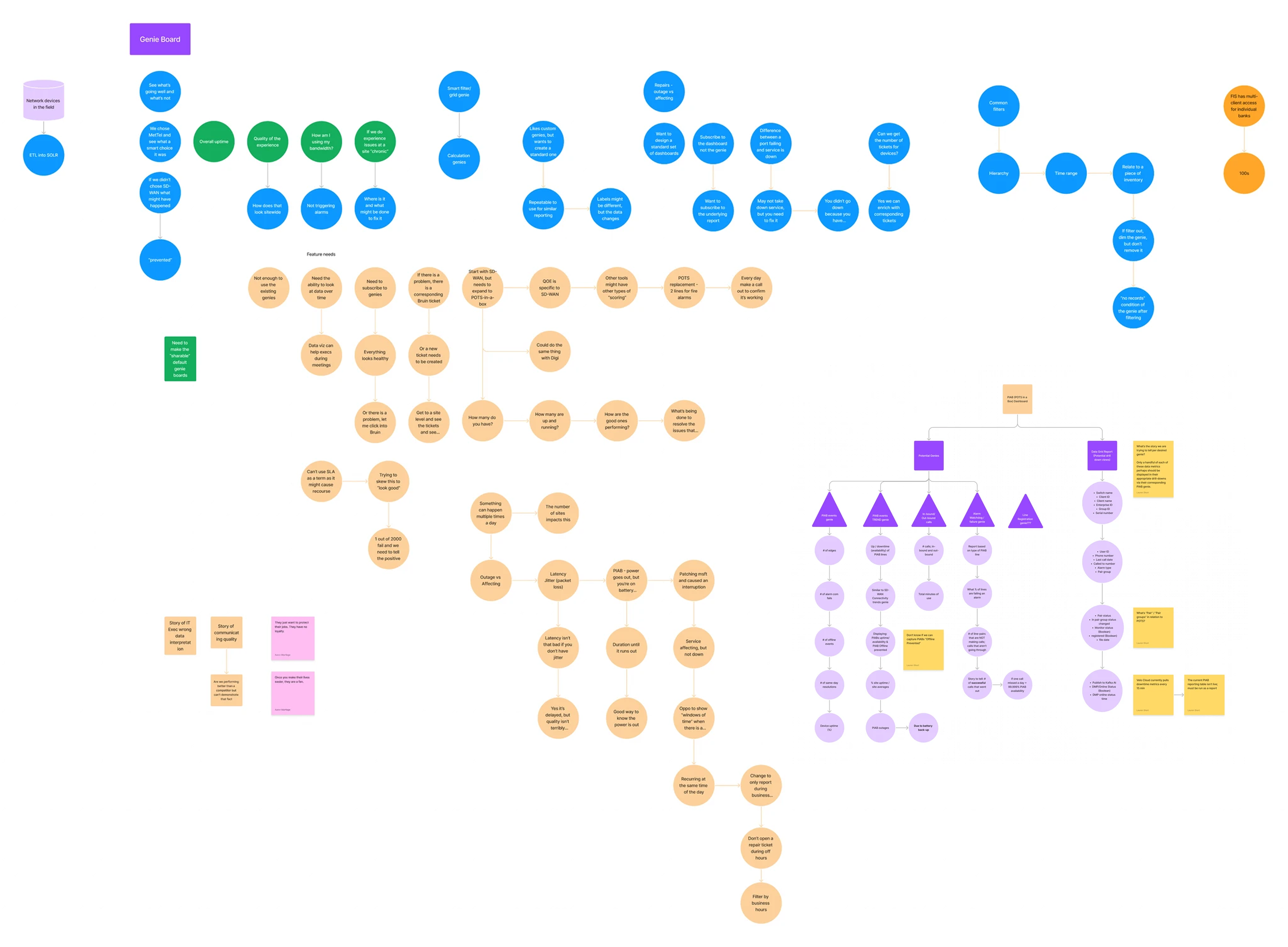
We began by hosting meetings with MetTel stakeholders, utilizing FigJam boards to map out ideas and push on the "why" behind their reporting requests. We discovered that consumer report meetings are narrative-driven, requiring executives to have solid visual data to explain SLA performance.
"We want our customers to see why they chose Bruin and see what a smart choice it was."— Jimmy S, Bruin CEO
"If they didn’t choose SD-WAN, customers would want to see what might have happened."— Jimmy S, Bruin CEO
"Bruin does its best to prevent device issues. If they do occur, we need to show where & what will be done to fix it."— Jimmy S, Bruin CEO
"Typically only about 1 out of 2000 devices fail, so we absolutely need to tell the factual positive of this story."— Matthew H, Service Mgmt Principal
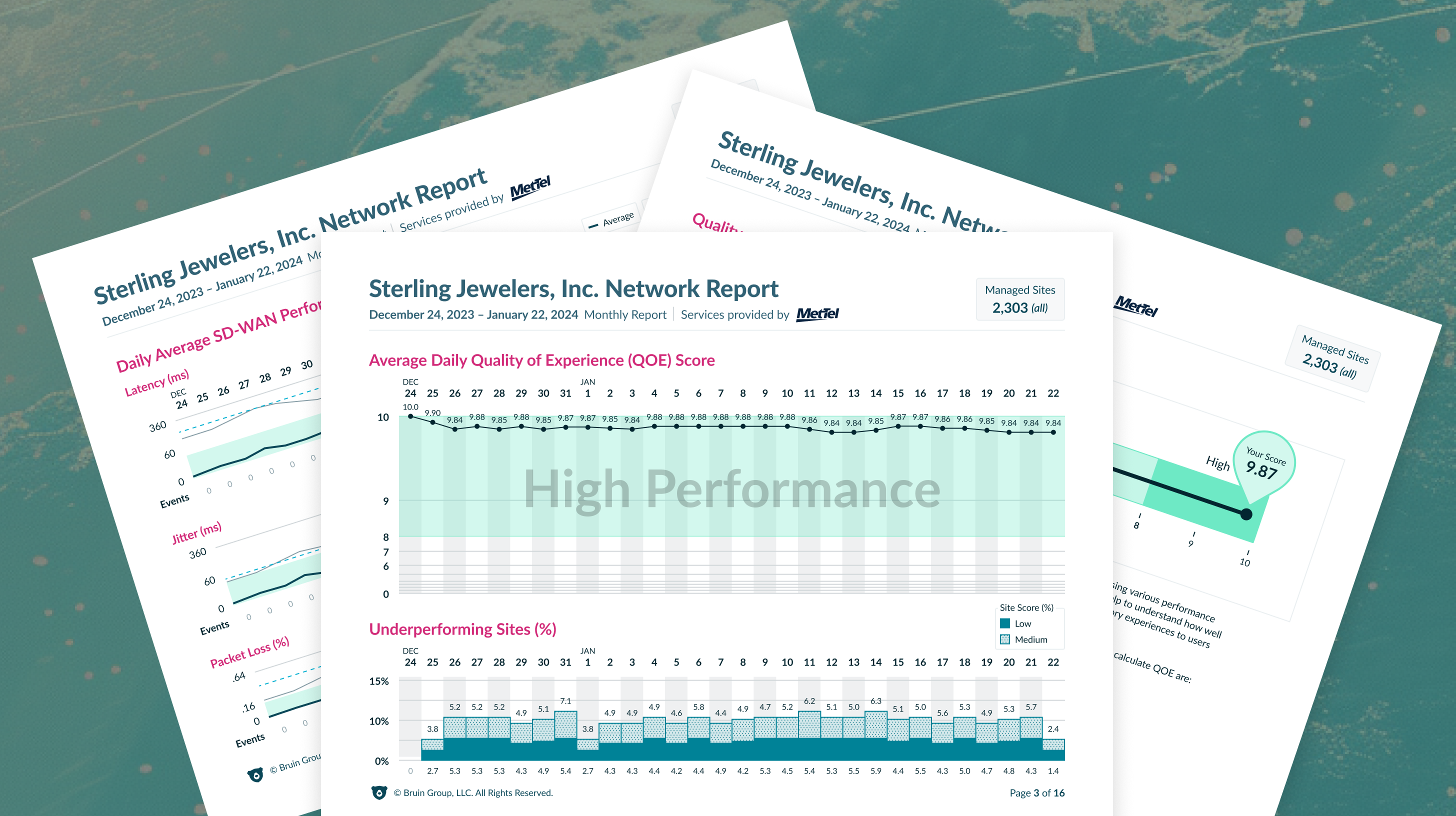
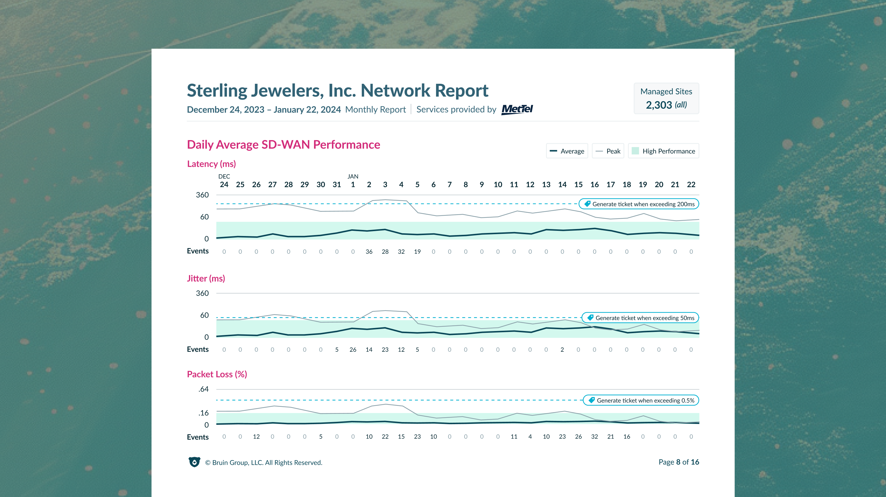
Beyond the digital dashboard, we designed printable PDF reports that utilized the same dashboard database. Adapting interactive charts to paper required solving major accessibility and usability hurdles. Without hover-states or tooltips, we developed detailed breakdowns using tabular data to highlight specific dates and numbers.
We tested the first round of printed reports using real-world data from Sterling Jewelers. Testing revealed that averaging the daily metrics across all sites flattened the charts, making the visualizations look empty or "null." Because Bruin's network was exceptionally stable, the near-perfect scores showed no visual variation, leading users to believe the data was broken.
"Typically only about 1 out of 2000 devices fail, so we absolutely need to tell the factual positive of this story." — Matthew H, Service Mgmt Principal
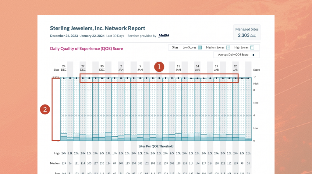
To clear up confusion, we revised the charts and shifted the narrative to emphasize the "high performance" threshold. By highlighting that the vast majority of sites consistently performed in the excellent range, we replaced empty-looking averages with clear, reassuring proof of network health, boosting customer confidence.
We delivered complete, high-fidelity reporting interfaces for both web and print, integrating SD-WAN, PIAB, and Starlink data into a single source of truth. By focusing on threshold-based storytelling, the final designs validated Bruin's network quality at a glance.
Obtaining accurate production data early is essential for making sound design decisions. In this project, we designed under the assumption that network failures were common, which led to high-fidelity layouts that fell flat when applied to Bruin's exceptionally stable real-world performance. Getting real data sooner would have saved significant design time and budget.
You don't always need complex overhauls to fix a usability problem. By simply shifting the visual emphasis from average fluctuations to high-performance thresholds, we resolved user confusion and turned a flat chart into a persuasive asset. Sometimes, a minor alignment adjustment is all it takes to build customer trust.