Designer
2024

About
Border UX is a design agency with a cross-border team spanning from San Diego to Tijuana. While working at Border UX, I helped coordinate and lead the redesign of our company website to celebrate San Diego and Tijuana’s title of becoming the World Design Capital (WDC) in 2024.
My Role
Curated branding mood boards
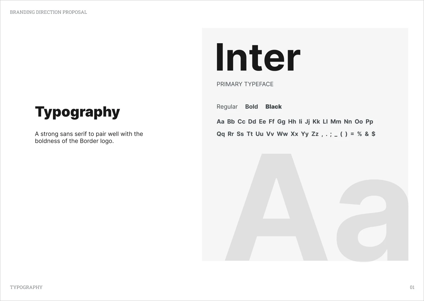
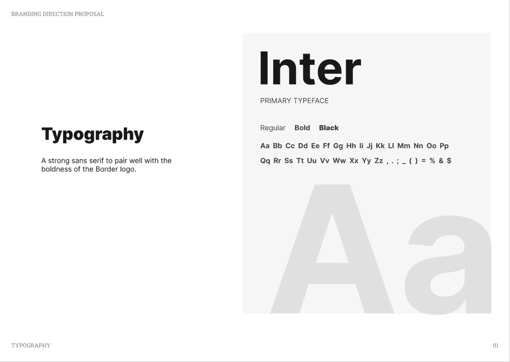
Designed a style guide with new color and typography styles
Designed branded company Google Slide templates and pitch deck
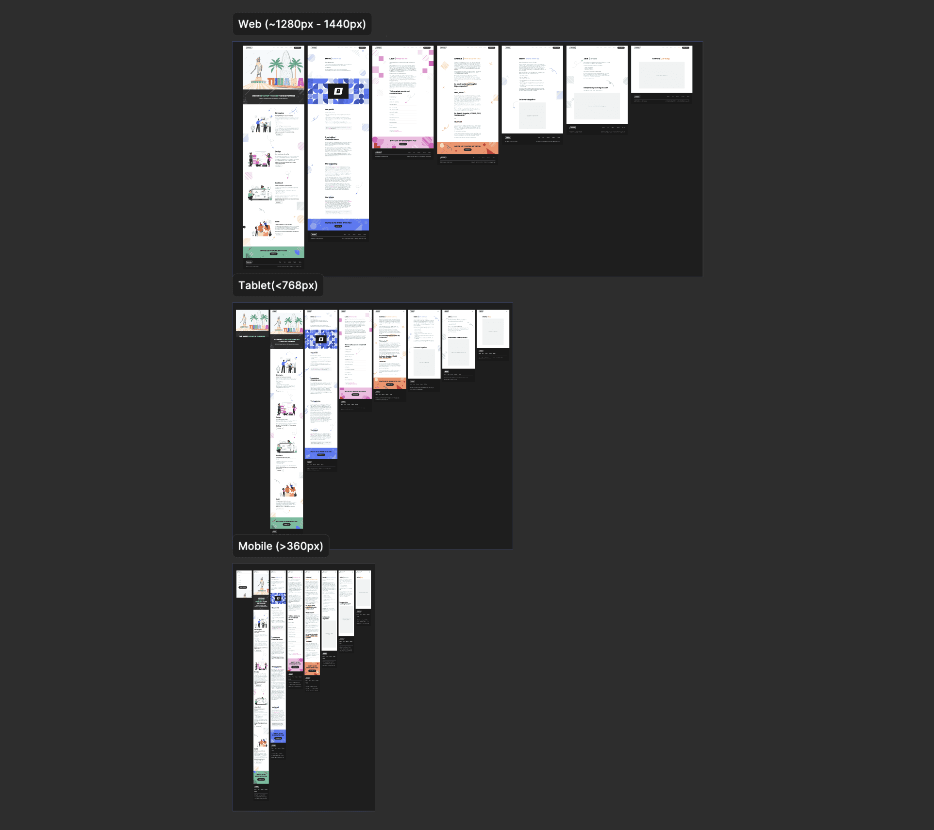
Created Figma designs of company site on mobile, tablet, and desktop
Converted designs to a live working website in Framer
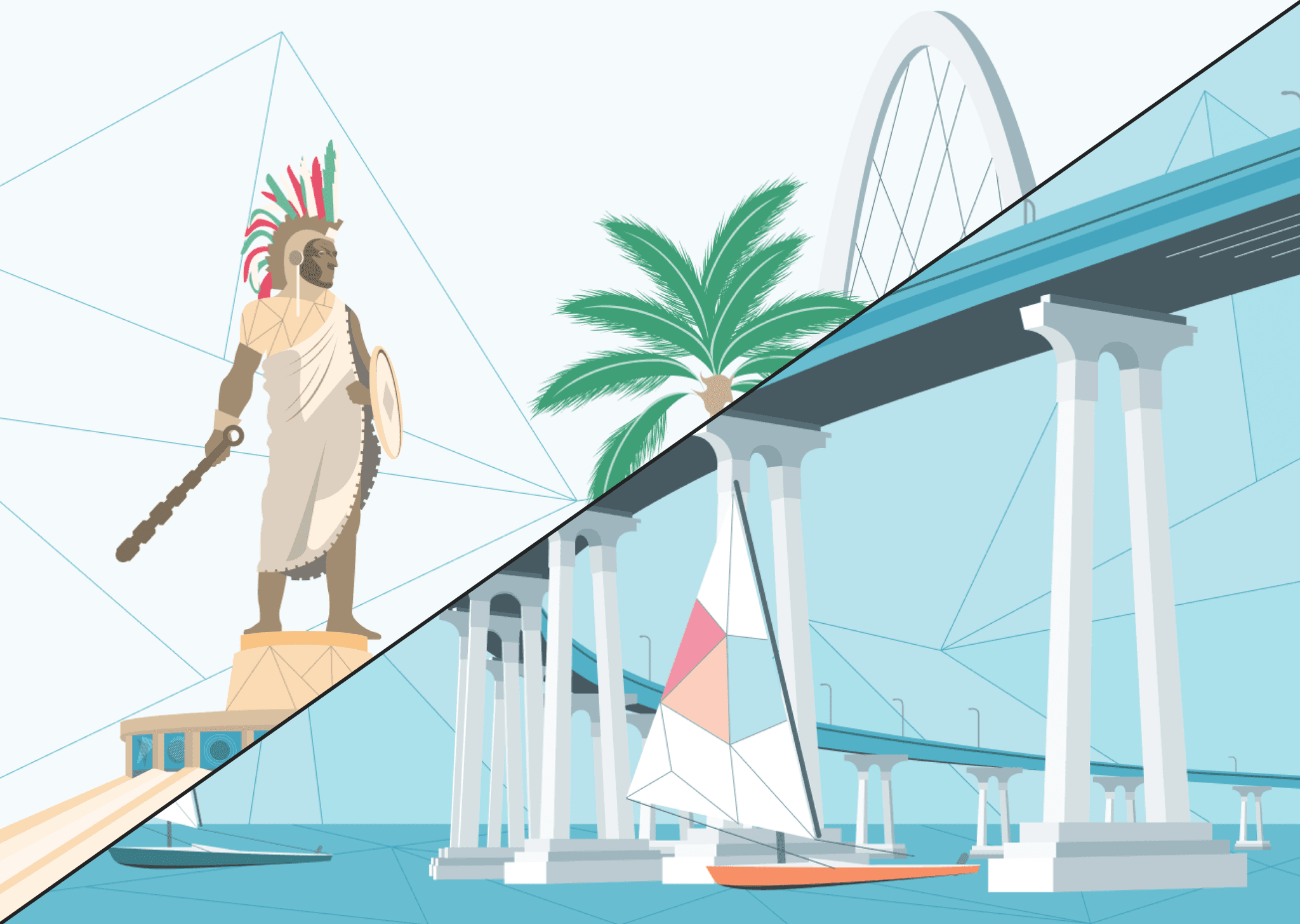
Designed illustrations representing the San Diego & Tijuana regions
Coded illustrations using basic html and css to add animations to hero
Agency
Border
Timeline
Dec, 2023 - Feb, 2023
Team
Manager: Aaron M.
Jr UX: Kristiana A.
UX: Myself
overview
While working at Border UX, I helped coordinate and lead the redesign of our company website to celebrate San Diego and Tijuana’s title of becoming the World Design Capital (WDC) in 2024.
scope & constraints
To celebrate 2024’s WDC recognition for our team’s local regions, we wanted to embark on a journey to reimagine our online presence. On this internal project, there were no constraints. It was either to go big or go home.
We strove to create a vibrant, cohesive, experience that not only celebrates our cross-border team, but also pays homage to the rich tapestry of culture and design that defines our cities roots.
opportunity
This was the one thing we kept in mind on this redesign journey. We are people helping people. Not people hiding behind the machine. Our redesign had to emphasize a humanistic approach and legitimacy, abiding by our own methodologies and ethos.
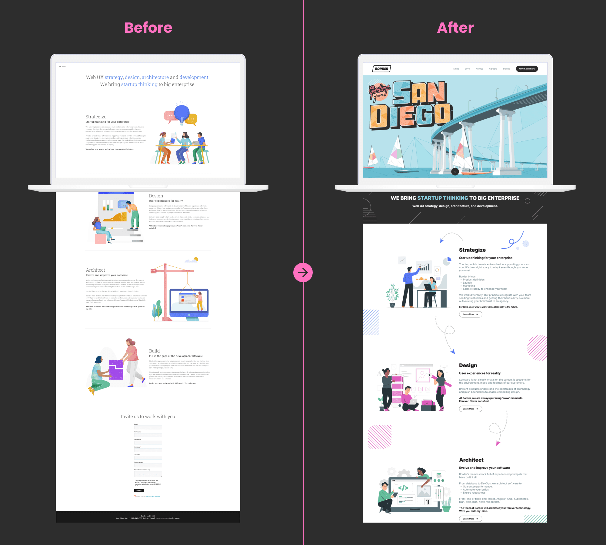
before and after
There was nothing innately wrong with our previous site. We just figured it needed to be spiffed up with some “pizazz” after a few years of being on the market. We thought to ourselves moving forward:
How can our website embody our company culture on the storefront while also celebrating the general roots of design and innovation?
mood boards
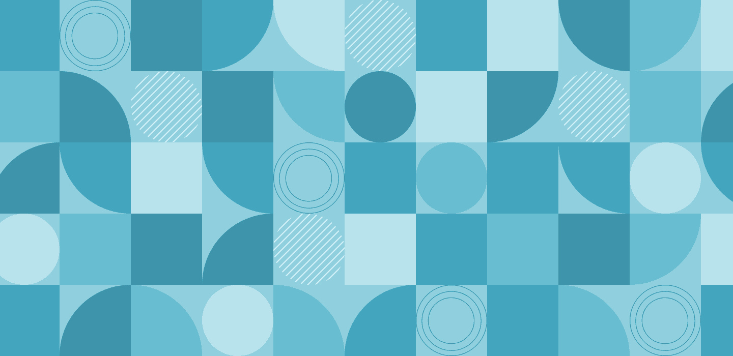
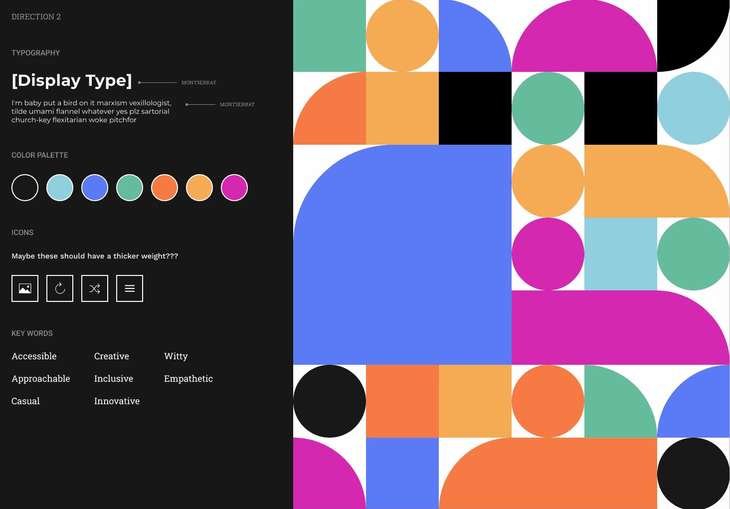
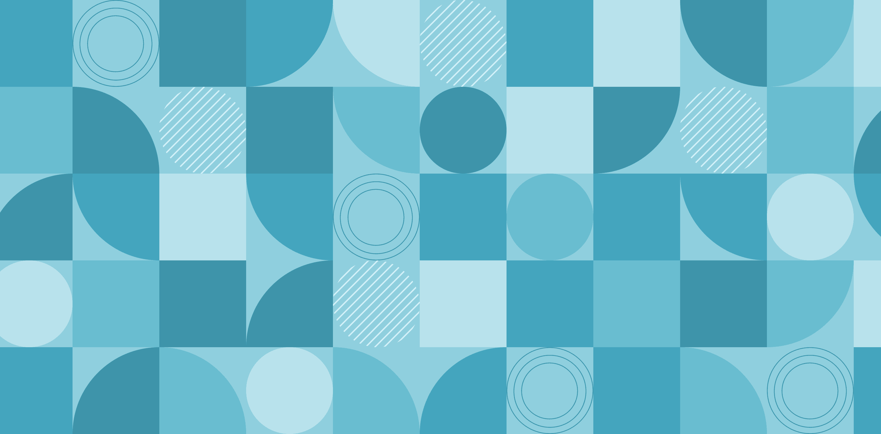
We delved deep into our mood boarding, experimenting with the use of geometric shapes, colors, and dynamic movement to pay homage to design and creativity.
We also wanted to be louder. To be bolder. Typography became our playground as we searched for the perfect balance between boldness and legibility. We also searched for a typeface that complimented the weight of Border’s logo, creating a more cohesive visual identity.


styleguide
Our previous brand identity lived solely on the web, with no official guidance to shape how we presented ourselves. As we chose to branch out to various mediums like company slide decks, it became clear we needed a unified look that reflects who we are today.
Inspired by San Diego and Tijuana’s World Design Capital title, we’ve settled on a vibrant color palette that celebrates the energy, culture, and creativity of these cities. Alongside this, we’ve crafted standardized shapes that reflect the dynamic spirit of design throughout the regions.
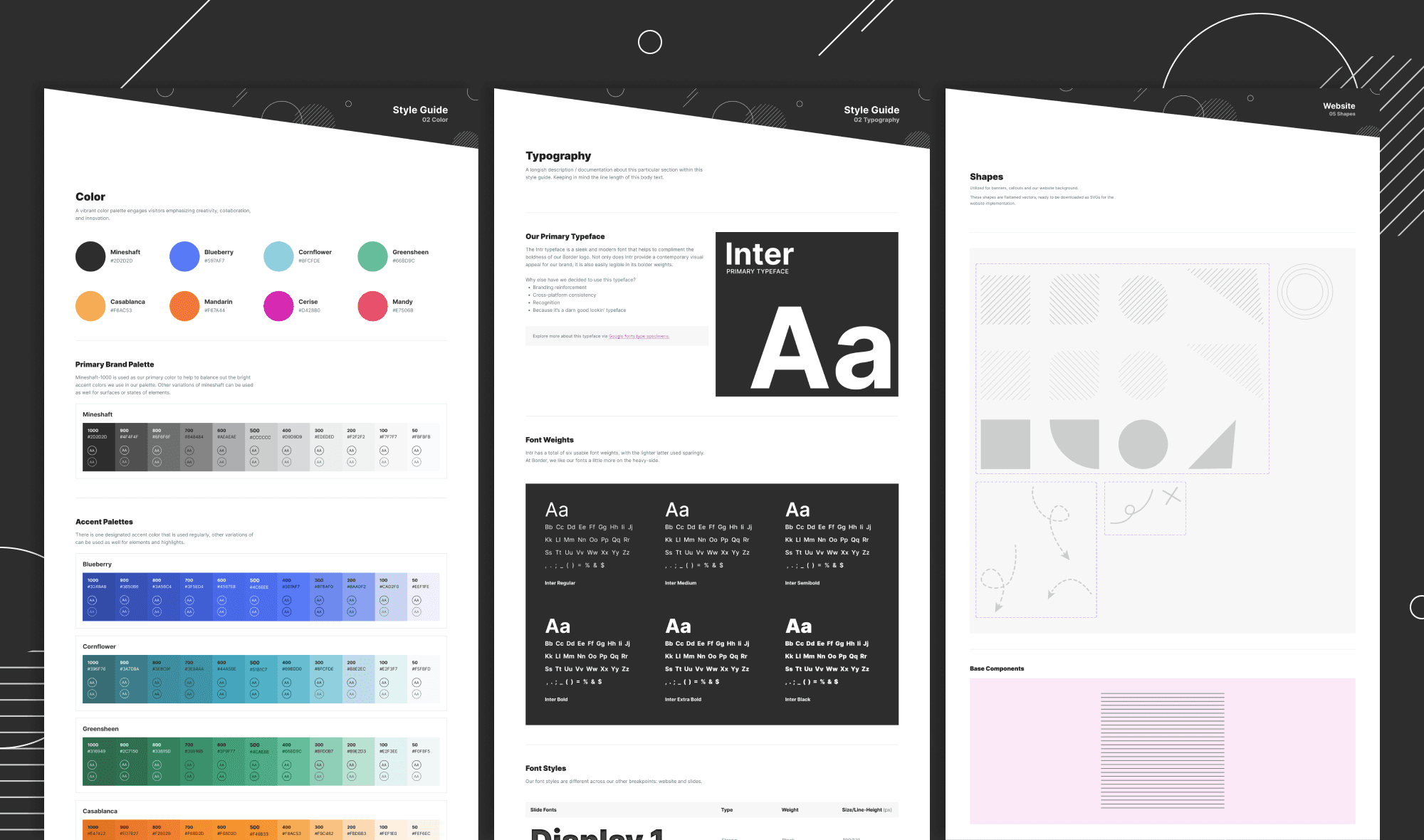
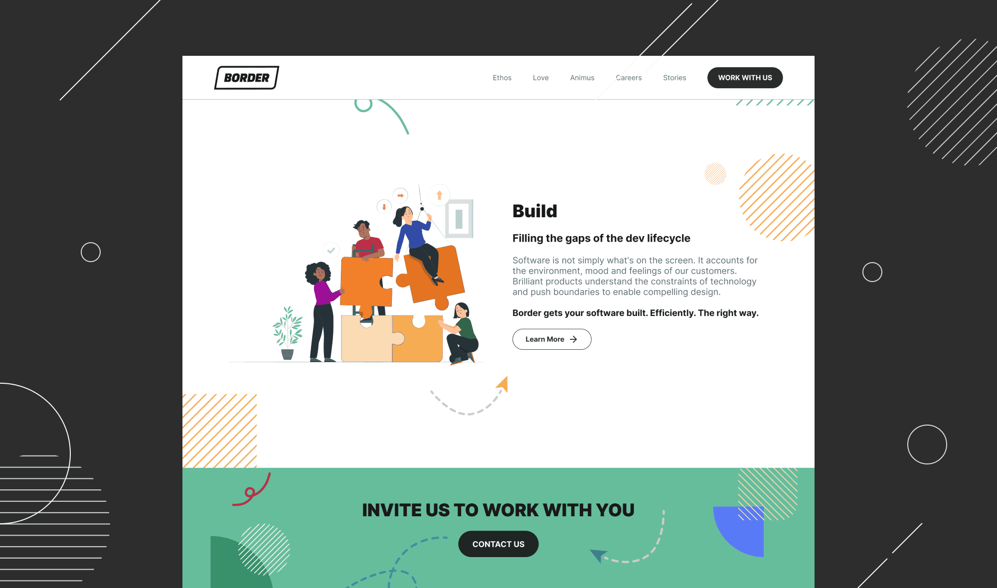
illustrations
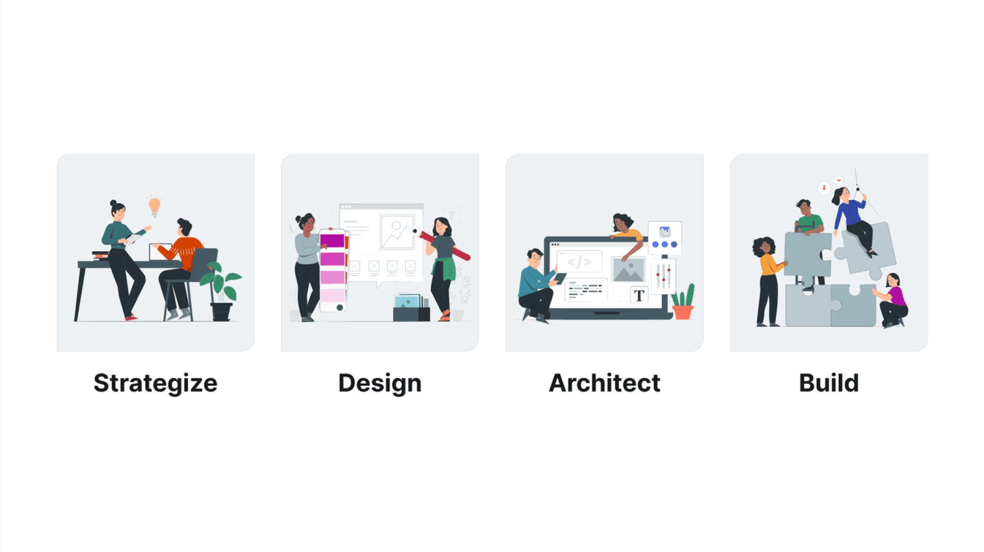
We found it necessary to always incorporate illustrations featuring people in tandem with the geometric shapes throughout our branding. The illustrations depict human interactions—collaboration, teamwork, and engagement with clients—highlighting the humanistic aspect behind our work and emphasizing our commitment to legitimacy and personal connection.
We aren’t individuals personified as shapes, we are individual people who build things with other people.
slide templates
Leveraging our newly developed visual elements like colors, typography and illustrations, we expanded our branding to company presentation slides. This was a logical next step in helping to solidify our new identity as an agency. We recognized the importance of presentations as key components in conveying our brand essence to future clients and partners.
Our slide decks were also created as customizable templates in Google Slides. This was to ensure that anyone in the company could easily draft their own stories while ensuring adherence to the brand. By maintaining consistency across all various materials, we helped to amplify our genuine image and impact in presentations.
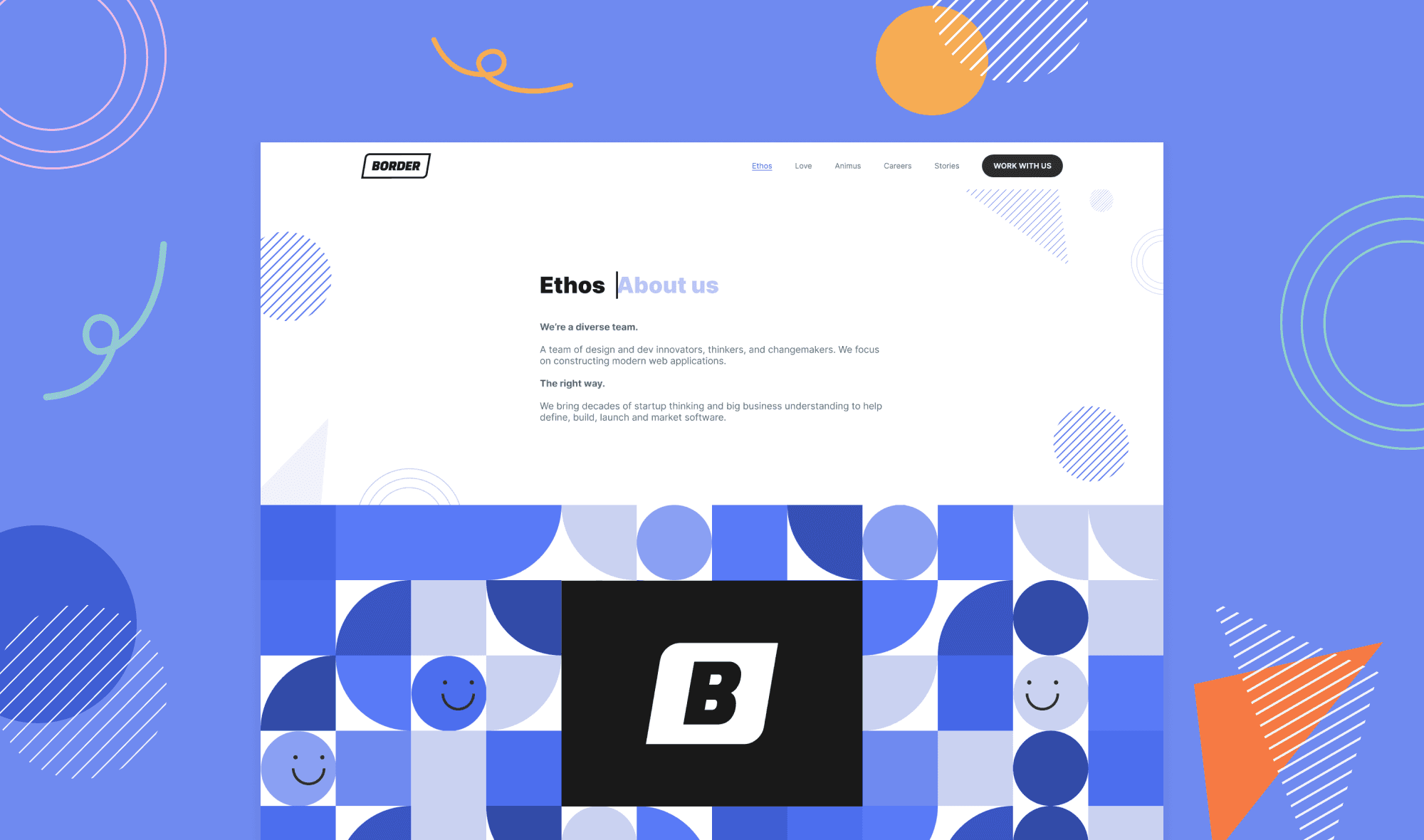
website design
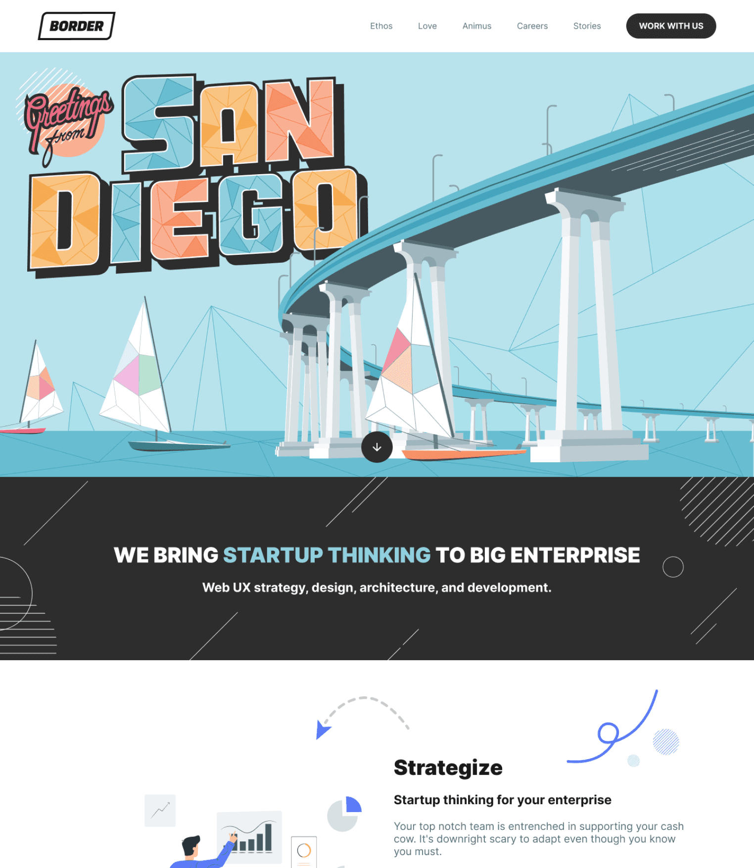
The design journey for Border’s new website began in Figma, where we reimagined every existing page.
For the content, we maintained our signature witty tone, enhancing it with bold typography and graphical elements, adding more personality to our messaging.
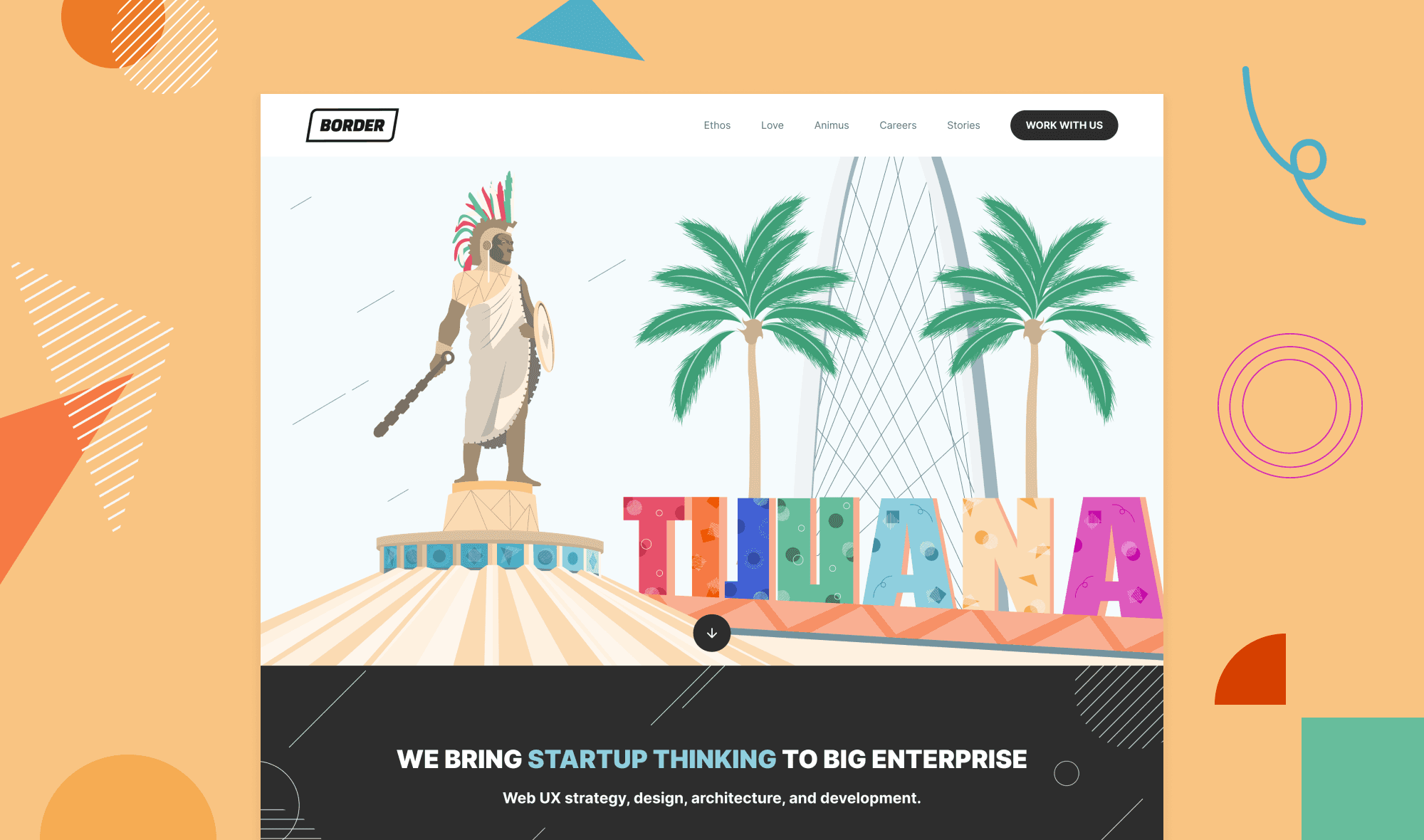
Each page showcases its own unique color palette and shapes, creating a distinct experience with every click—much like exploring different rooms at San Diego Design Week, where each space offers something fresh and exciting.
custom illustrations
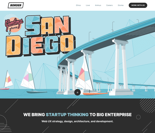
Reflecting on the Opportunity we had while building this site, we wanted to ensure our brand stood apart from the typical faceless corporation. Our goal was to make the hero space more than just a visual display selling what we do.
To achieve this, I helped us focus on who we are rather than dwelling on only what we do. I helped craft geometric illustrations inspired by the San Diego and Tijuana regions, blending bold shapes and vibrant colors. These illustrations serve as more than just aesthetic elements; they're windows into revealing who we are, where we come from, and what we stand for.
animations
At Border, we believe in pushing boundaries and continually expanding our skill sets. As designers, it's essential to understand the importance of bridging the gap between design and code. With a team of talented developers, coding is as integral to us as design, which inspired me to enhance the hero illustrations of our website using basic CSS and HTML.


Initially, my transition from a no-code background into the world of coding felt both intimidating and challenging. However, it turned out to be an incredibly rewarding experience. It opened up new possibilities for digital animation and storytelling, allowing me to push the limits of what I could achieve, both for the website and beyond.
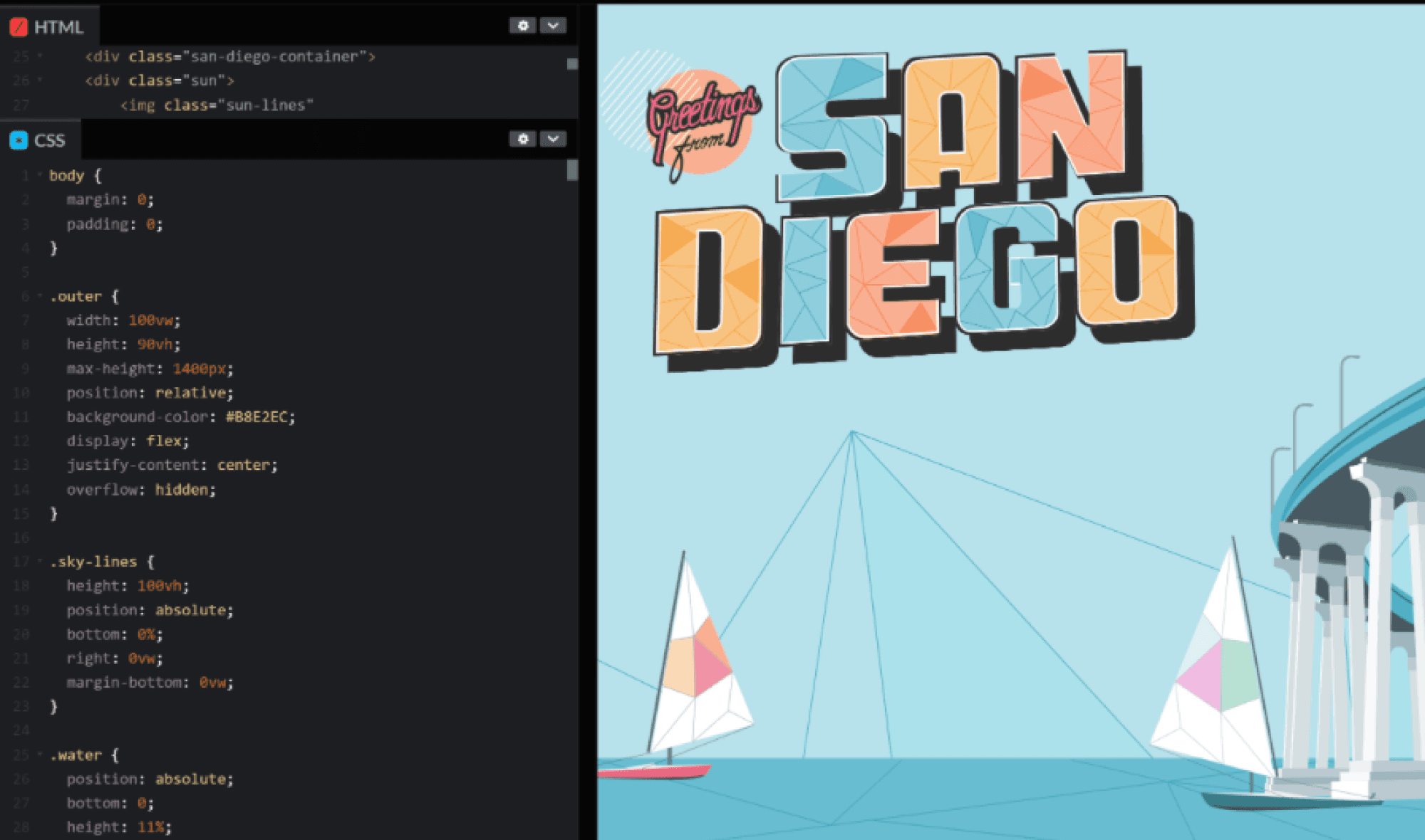
To bring our vision to life, I used an online code editor, CodePen, to help build the animated hero illustrations. We imported all of our Figma assets via HTML, re-positioned the elements with CSS properties, and with the magic of CSS @keyframes, I added movement to the illustrations, transforming them from static images to animations.
technical hurdles
After designing our awesome new website, we knew we needed a good tool to host it for the world to see. Initially, we chose Webflow for its flexible CMS and no-code design features.
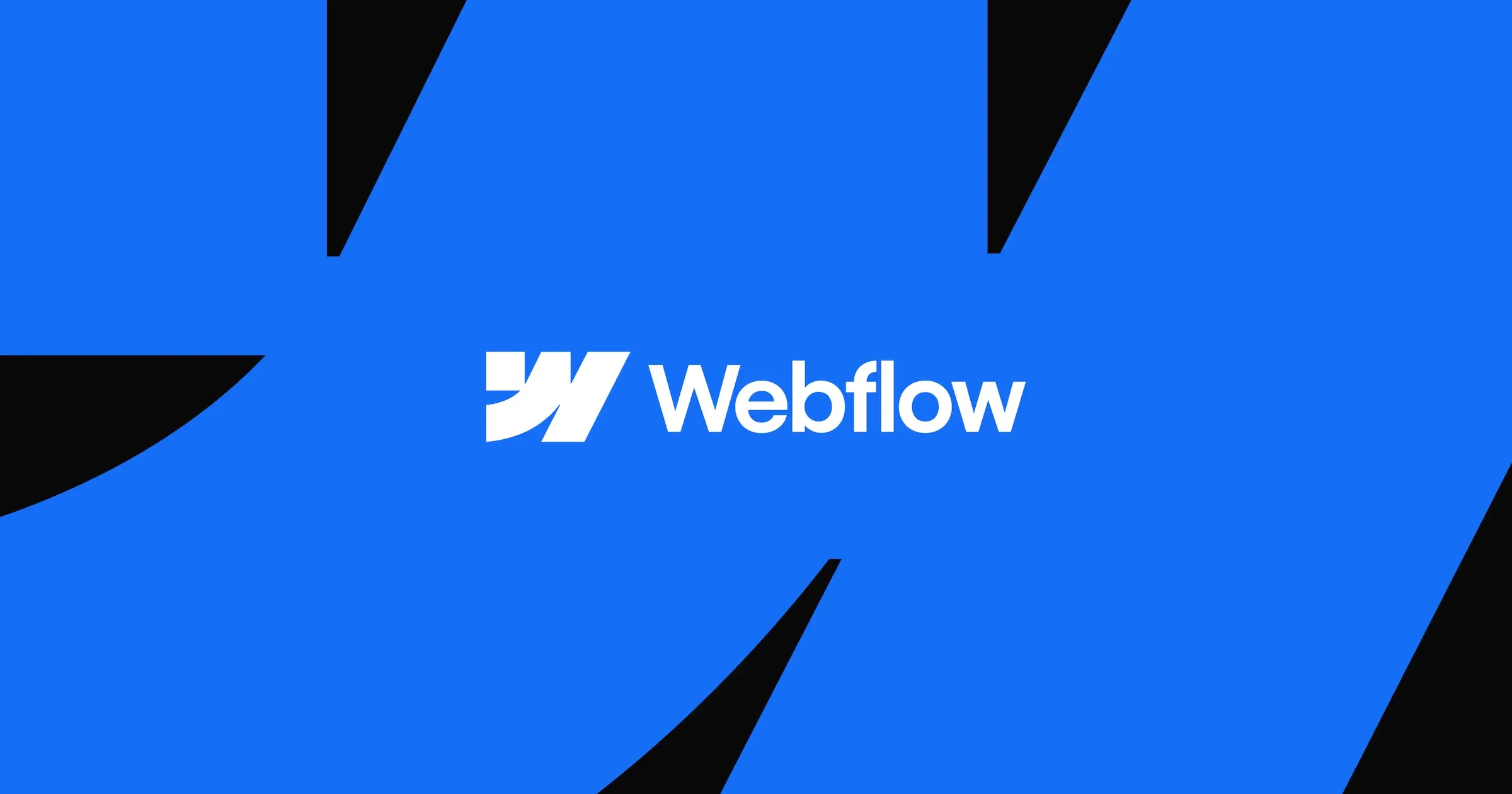
However, we kept running into little pickles. Our custom code failed to work and our site speed diminished due to the constant rendering of Java Script-only animations. There were even frequent crashes while working in the designer tool. However, the biggest problem of all, is that no two designers can work on a single project simultaneously. What began as minor issues escalated into time-consuming dilemmas, leaving us grappling with frustrations and setbacks. We knew we needed to find an alternative. Particularly a more collaborative tool. After all, we are a design agency, and often work as a team to get things done faster.
That’s when we found… Framer.
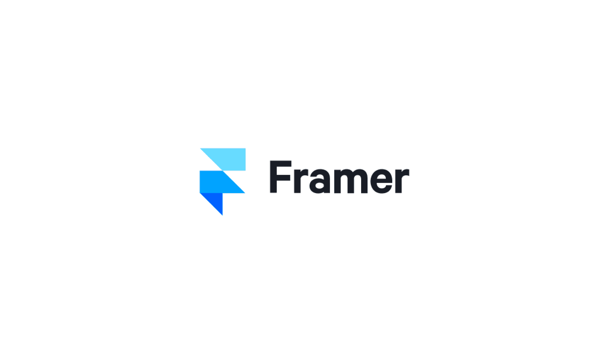
The transition to Framer was a game-changer. It’s another web builder tool, with a face lift that looks very similar to Figma (our primary design tool when building client products). With its collaborative ability and a more intuitive user-interface, Framer allowed us to unleash our skills like never before. With Framer, we were able to streamline our workflow significantly, reducing our turnaround time from a lengthy three weeks with Webflow to just one week, starting from scratch and completing the redesign project.
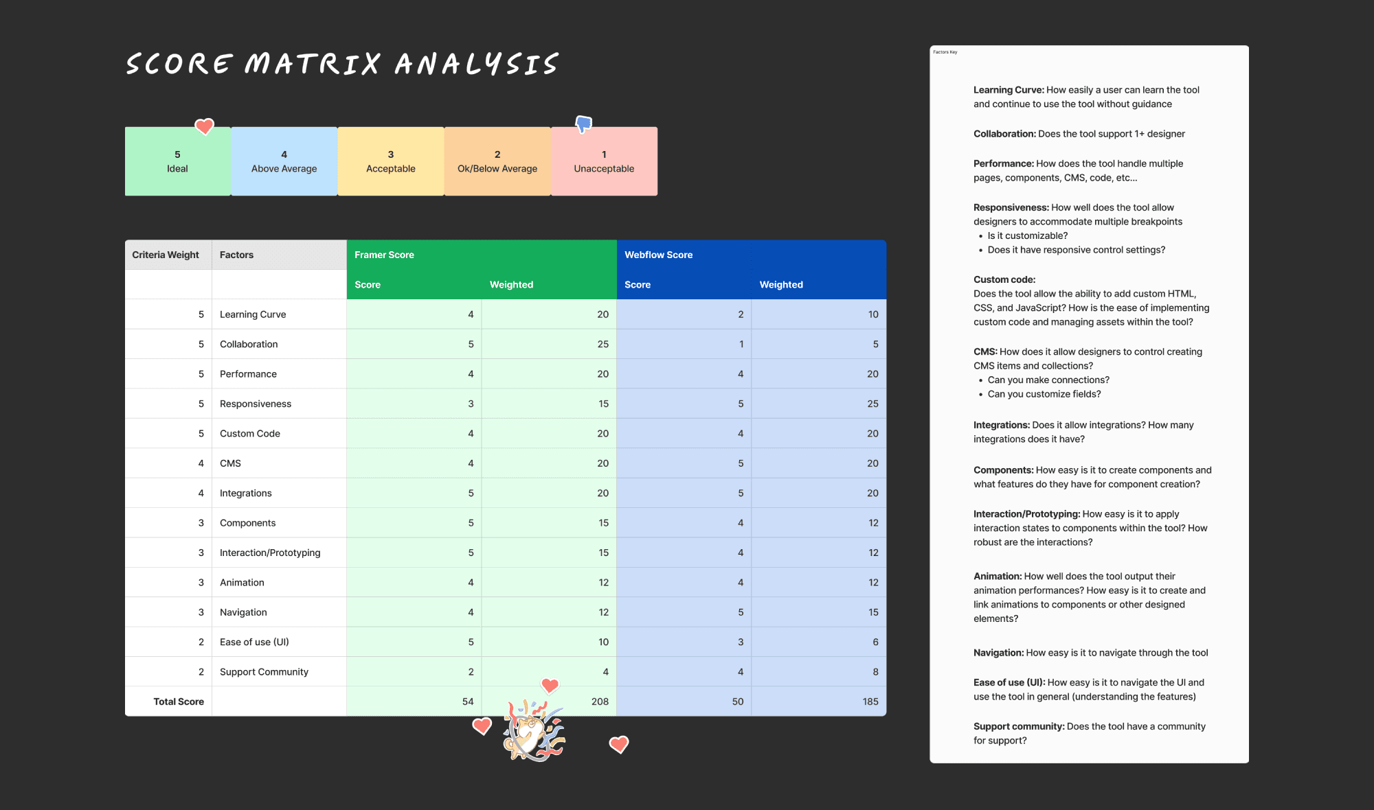
To further solidify our decision between Framer and Webflow, we created a score matrix analysis. We asked questions tailored to our needs as a collaborative design agency, like:
How easily can a user learn the tool and continue to use the tool without guidance?
How well does the tool handle multiple pages, components, CMS, and code?
These questions helped us assess the long-term suitability of each tool for both internal and client work. Then we broke-down and organized these questions into categories, or key factors. Each factor was weighted on a scale of 1-5, based on its importance: “1” being least ideal for our agency’s needs and “5” being the most ideal or most important need to consider.
Finally, we placed and weighted the scores to determine the crowned winner for our requirements.
Final Deliverable
Powered by

takeaways
While Webflow initially seemed like the perfect choice to host our website for its CMS flexibility and no-code features, I learned the importance of adaptability when technical challenges arose. Being open to exploring alternative tools like Framer allowed us to overcome obstacles and streamline our workflow.
Dabbling in code as a designer was initially daunting, especially since numbers and syntax weren’t my strengths. However, it turned out to be incredibly rewarding, as I picked up a new skill more easily than I expected. This gave me a solid foundation in development practice, which will help me bridge the gap between design and code. With this understanding, I can better communicate design intentions using simple CSS animations.