Protected Page

Designing an app for rock n' roll fans

Designing an app for rock n' roll fans

Designing an app for rock n' roll fans

Student designer

2021

About

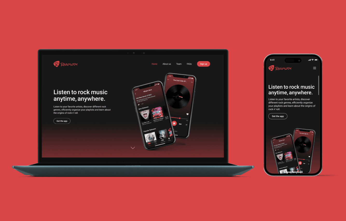
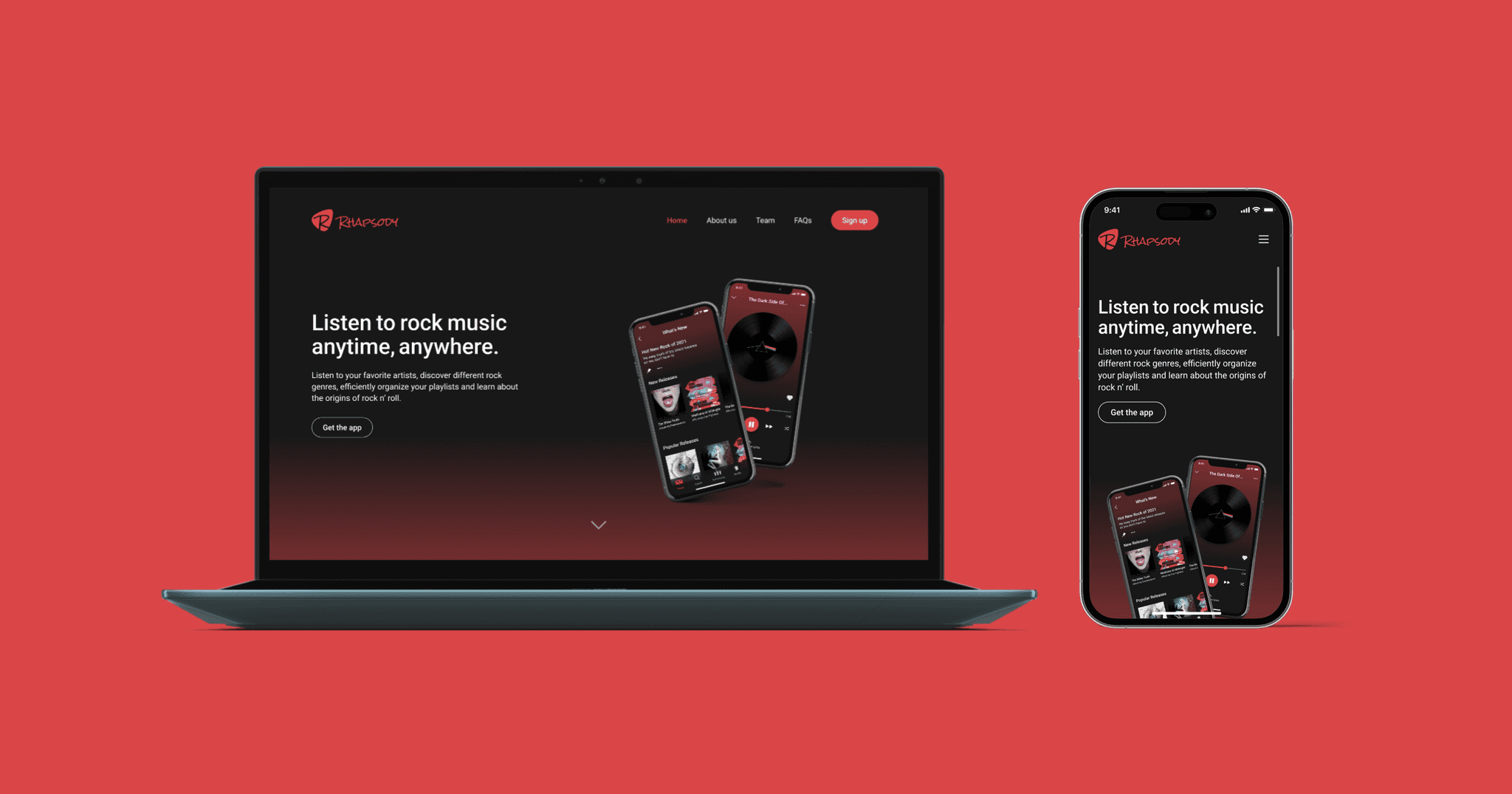
Rhapsody is a music app that I created for a UX project in my third year of college as an intro to UX and learning Figma as a design tool. The app is catered towards rock genre music lovers. This project consisted of five separate class projects over the course of three months that all contributed to the research, study, and design of a conceptual music app for the iPhone interface. The end result consisted in a hi-fidelity interface with a clickable prototype.

My Role
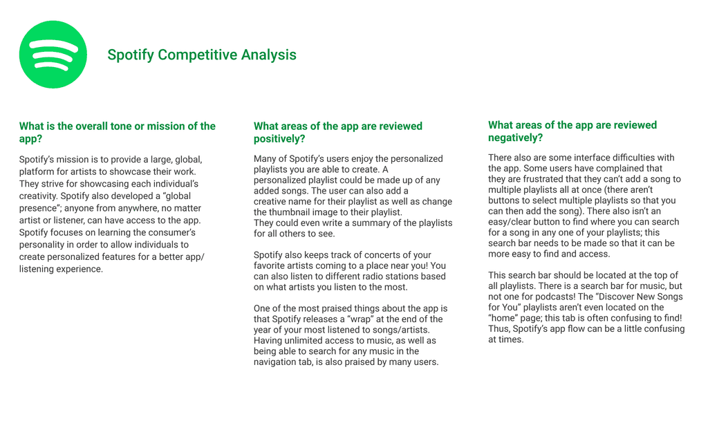
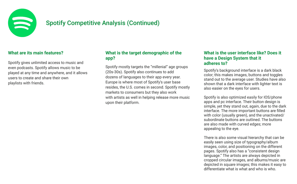
  • Conducted a competitive analysis of mainstream music apps

  • Mapped competitive user flow

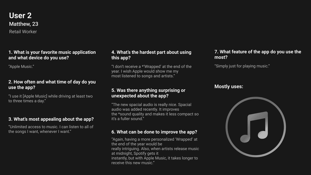
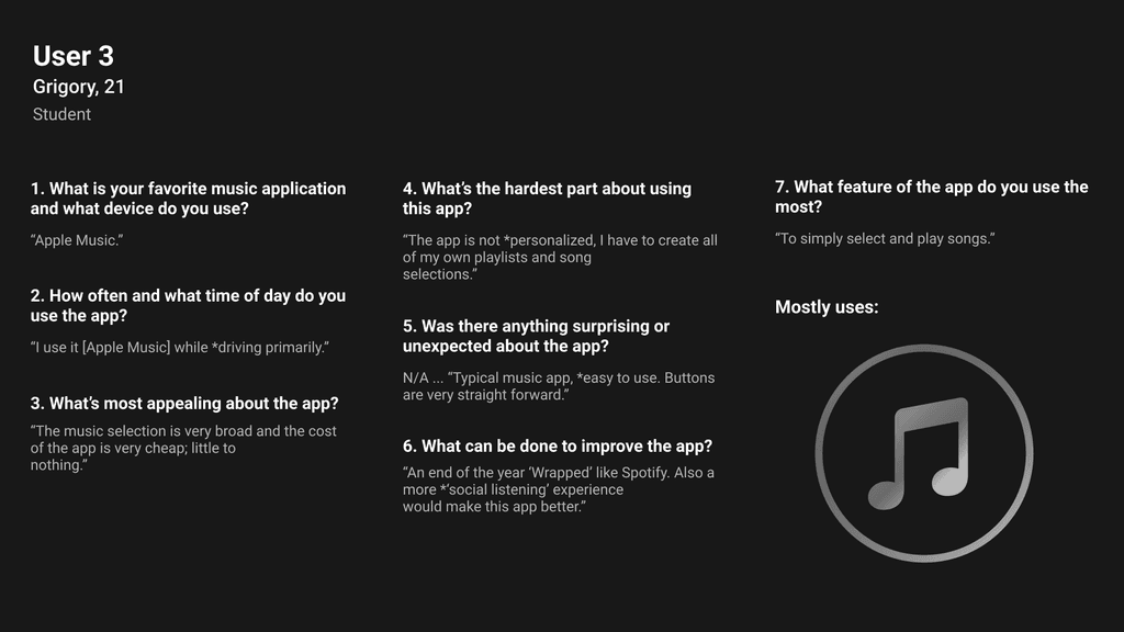
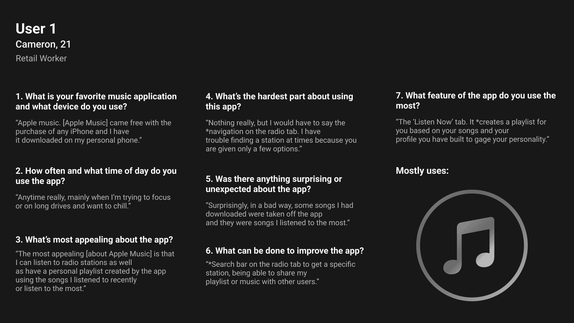
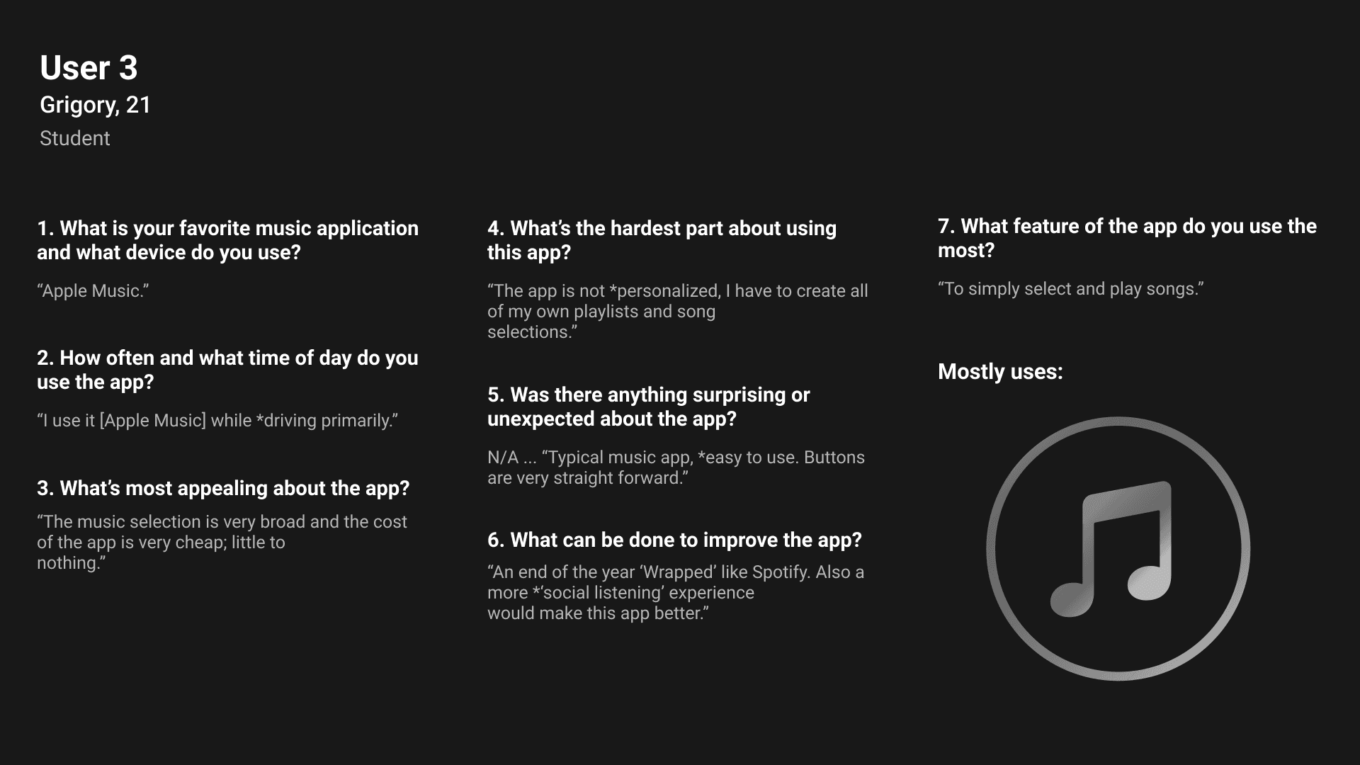
  • Researched and interviewed students and outside users

  • Created user personas based on user research

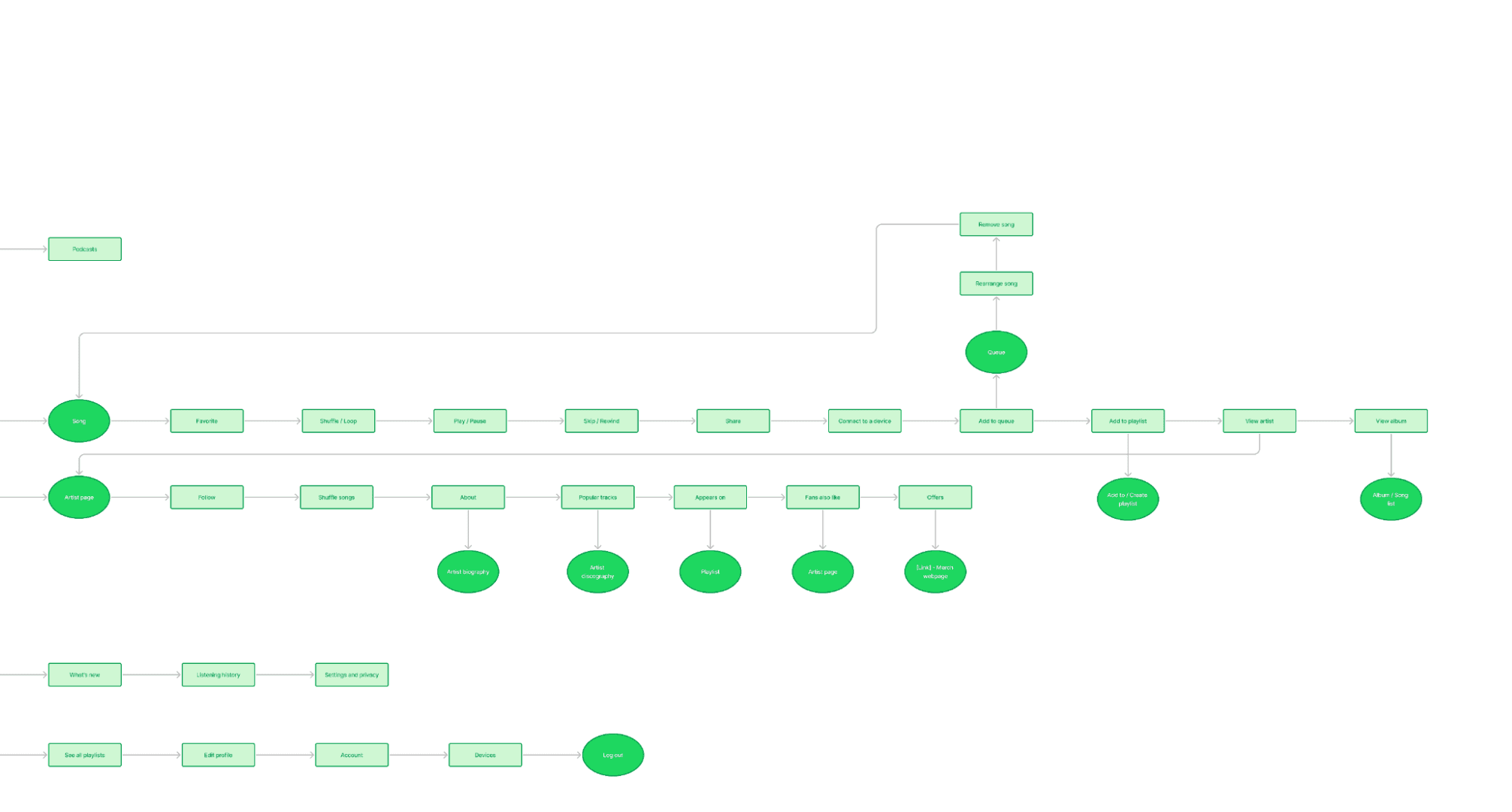
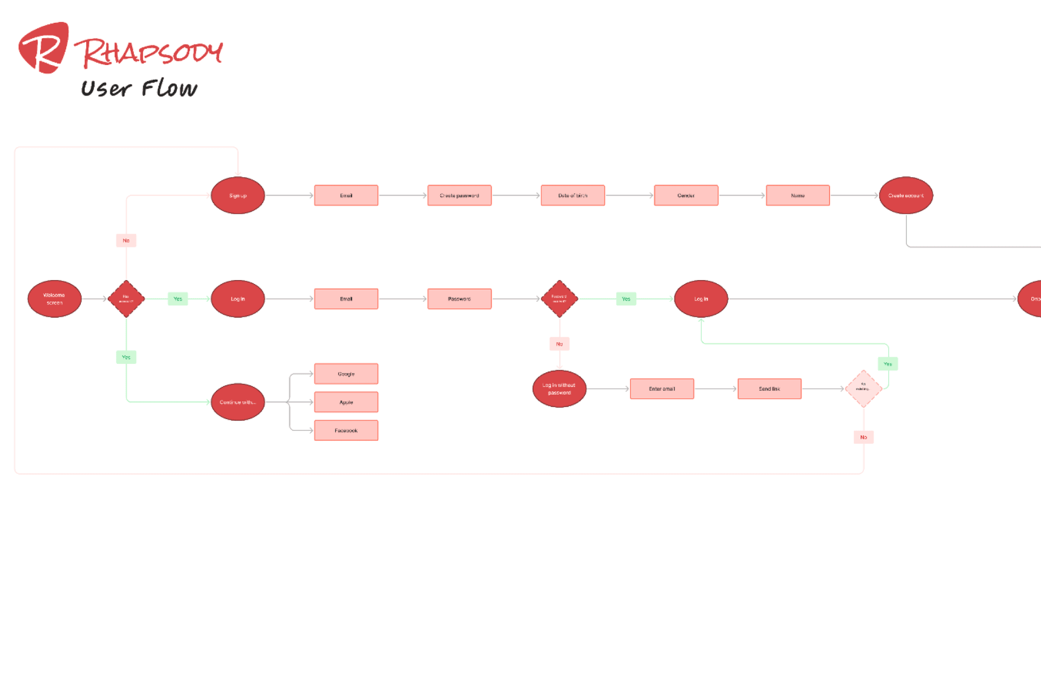
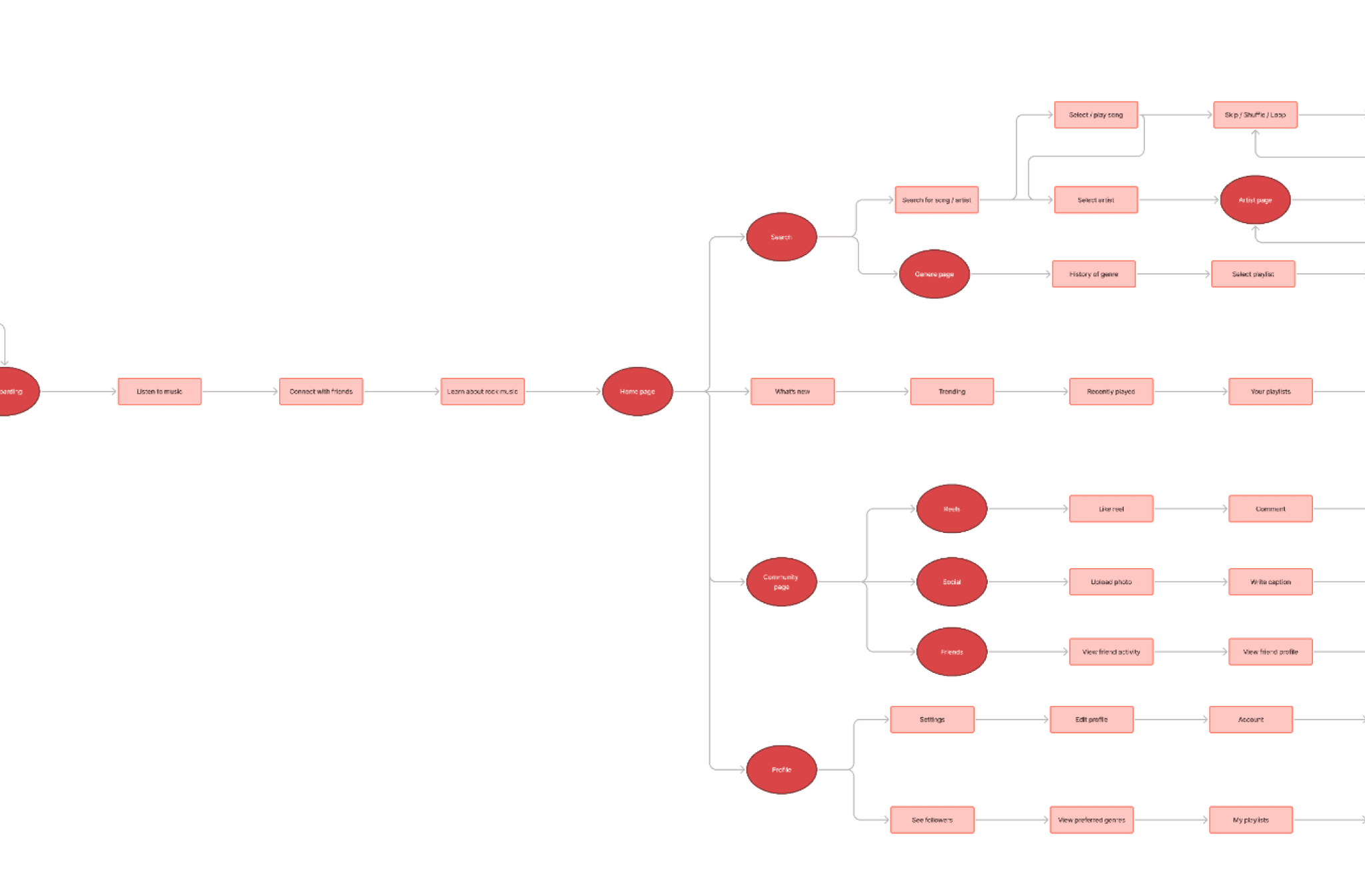
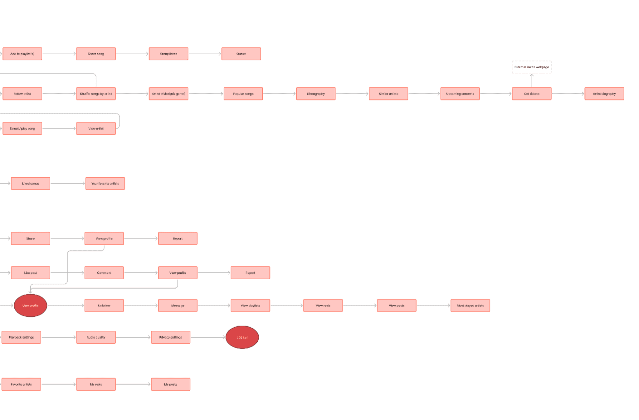
  • Mapped user flows and information architecture of the app

  • Drafted lo-fi wireframes with interactive prototype for initial testing

  • Designed a final hi-fi wireframe with full interactive prototype

Class

Intro to UX - San Diego State University

Timeline

Aug - Nov, 2021

Team

UX: Myself

*Special thanks to my professor and fellow classmates who made this class an awesome experience!
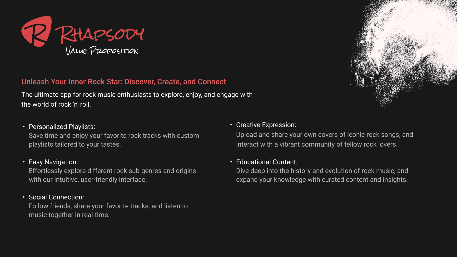
overview

Rhapsody is a music app, dedicated to bringing the rock community together through music, collaboration, and local events

Rhapsody is a music app, dedicated to bringing the rock community together through music, collaboration, and local events

The app aims to create a seamless and intuitive user experience, while enhancing the engagement and satisfaction of rock music enthusiasts.

Scope and constraints

The project consisted of four separate class projects spanning over the course of three months, each contributing to the research and design of the app

The project consisted of four separate class projects spanning over the course of three months, each contributing to the research and design of the app

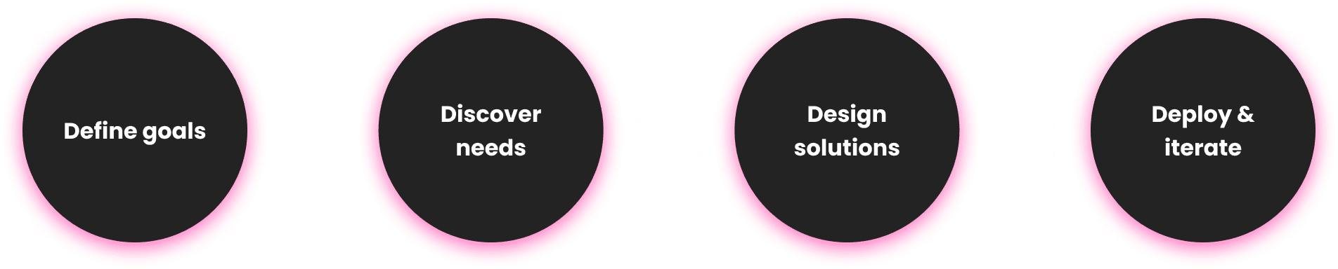
For this intro to UX class project, the goal was to create a high-fidelity prototype with an intuitive interface of a commercialized app. This was achieved through four separate projects:


1. User and competitive research

2. User personas
3. Low-fidelity app for testing

4. Hi-fidelity app with working prototype

opportunity

The app needed to be easy to use and potentially solve a real-world user problem

The app needed to be easy to use and potentially solve a real-world user problem

During the research phase of the project, I aimed to understand the specific features and functionalities that music app users valued as well as the pain points they experienced with the current app(s) they use. By analyzing user feedback and identifying areas for improvement, I sought to create a music app with a unique concept that would enhance the user experience for rock music enthusiasts.

The goal with Rhapsody was to create a seamless and intuitive user experience, keeping in mind user pain points with other music apps for potential improvements.

process

I used an iterative four step lean UX approach

I used an iterative four step lean UX approach

Research

I conducted interviews with real users who use music apps daily

I conducted interviews with real users who use music apps daily

What I learned

Desire for personalized playlists

Desire for personalized playlists

Most of my interviewees used Apple Music, which at the time, lacked personalized playlist features. Users had to manually curate their own playlists, adding songs one at a time.

Need for community and shareability

Need for community and shareability

I found out that many users wanted the ability to add friends, see what music their friends were listening to, and to share music internally within the app or through social media.

I analyzed Spotify (2021), the dominant player in the music app market, to identify strengths and user frustrations

I analyzed Spotify (2021), the dominant player in the music app market, to identify strengths and user frustrations

What I learned

Users praised the personalization of playlists

Users praised the personalization of playlists

Users appreciated Spotify's ability to create personalized playlists with custom images and names, which can be kept private or shared with the broader Spotify community.

Confusion around how to discover new music

Confusion around how to discover new music

Although appreciative of being able to find one's most recently played songs, users were confused on where to find recommended playlists based on their most listened tracks.

Fustration with playlist creation

Fustration with playlist creation

Users were frustrated by the inability to add multiple songs to multiple playlists at once. This slowed users for those who wanted to share their favorite tracks with the Spotify community.

Dark interfaces are easier for legibility

Dark interfaces are easier for legibility

While still debated, some studies suggest that dark interfaces are easier on the eyes. Users stated they enjoy Spotify’s dark mode design for easier legibility.

I analyzed Spotify (2021), the dominant player in the music app market, to identify strengths and user frustrations

What I learned

Users praised the personalization of playlists

Users appreciated Spotify's ability to create personalized playlists with custom images and names, which can be kept private or shared with the broader Spotify community.

Confusion around how to discover new music

Although appreciative of being able to find one's most recently played songs, users were confused on where to find recommended playlists based on their most listened tracks.

Fustration with playlist creation

Users were frustrated by the inability to add multiple songs to multiple playlists at once. This slowed users for those who wanted to share their favorite tracks with the Spotify community.

Dark interfaces are easier for legibility

While still debated, some studies suggest that dark interfaces are easier on the eyes. Users stated they enjoy Spotify’s dark mode design for easier legibility.

Creating a user flow of Spotify to understand the basic information architecture of music applications

Creating a user flow of Spotify to understand the basic information architecture of music applications

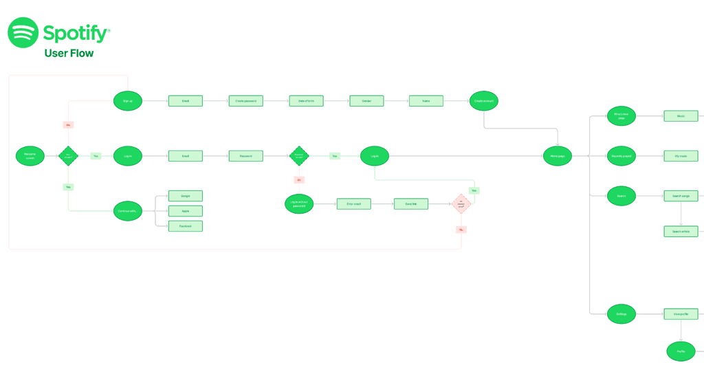
When creating Spotify’s user flow, I began to further understand the common patterns and happy paths of commercialized music apps. I also gained a good sense of the similar flows I wanted to include in my own app due to their intuitive nature, like the app onboarding screens and the music mini-player.
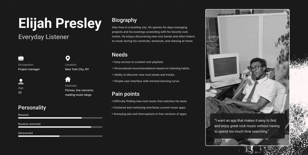
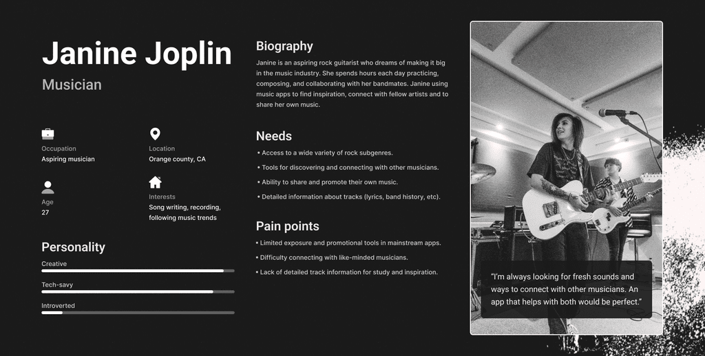
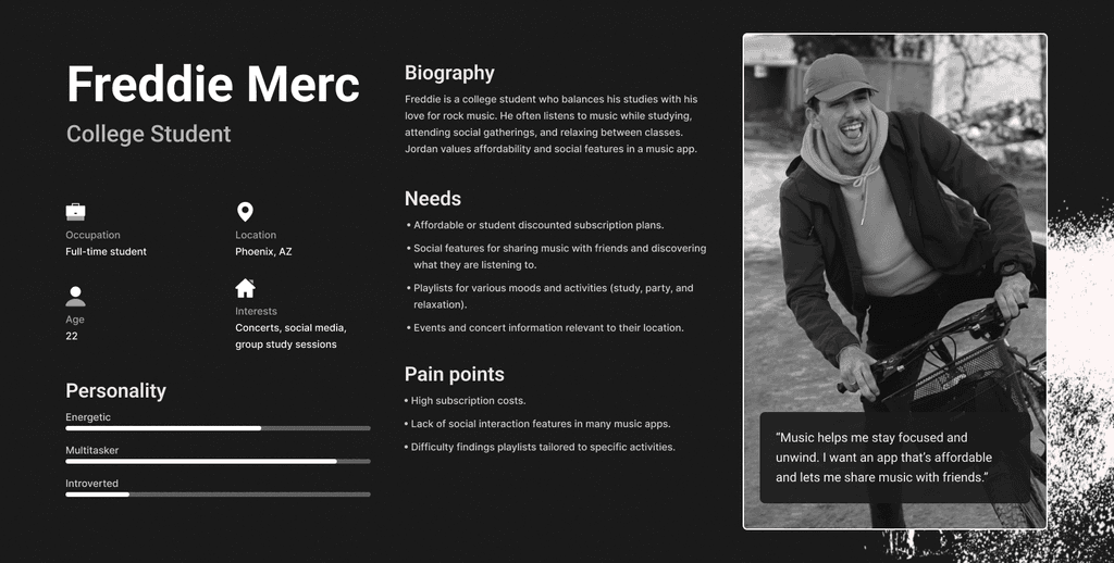
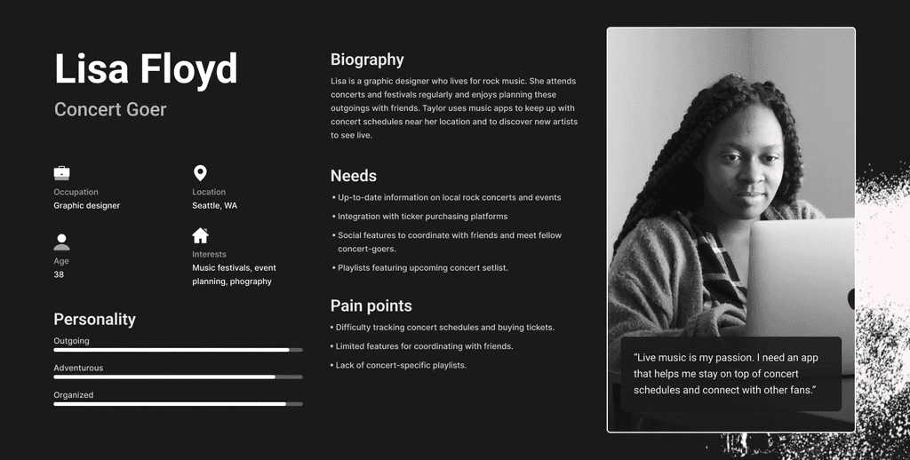
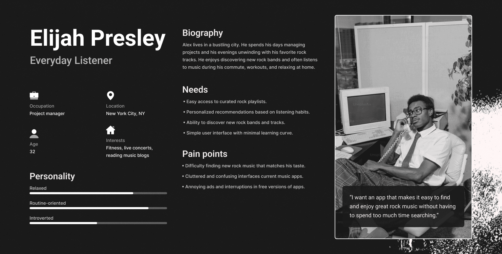
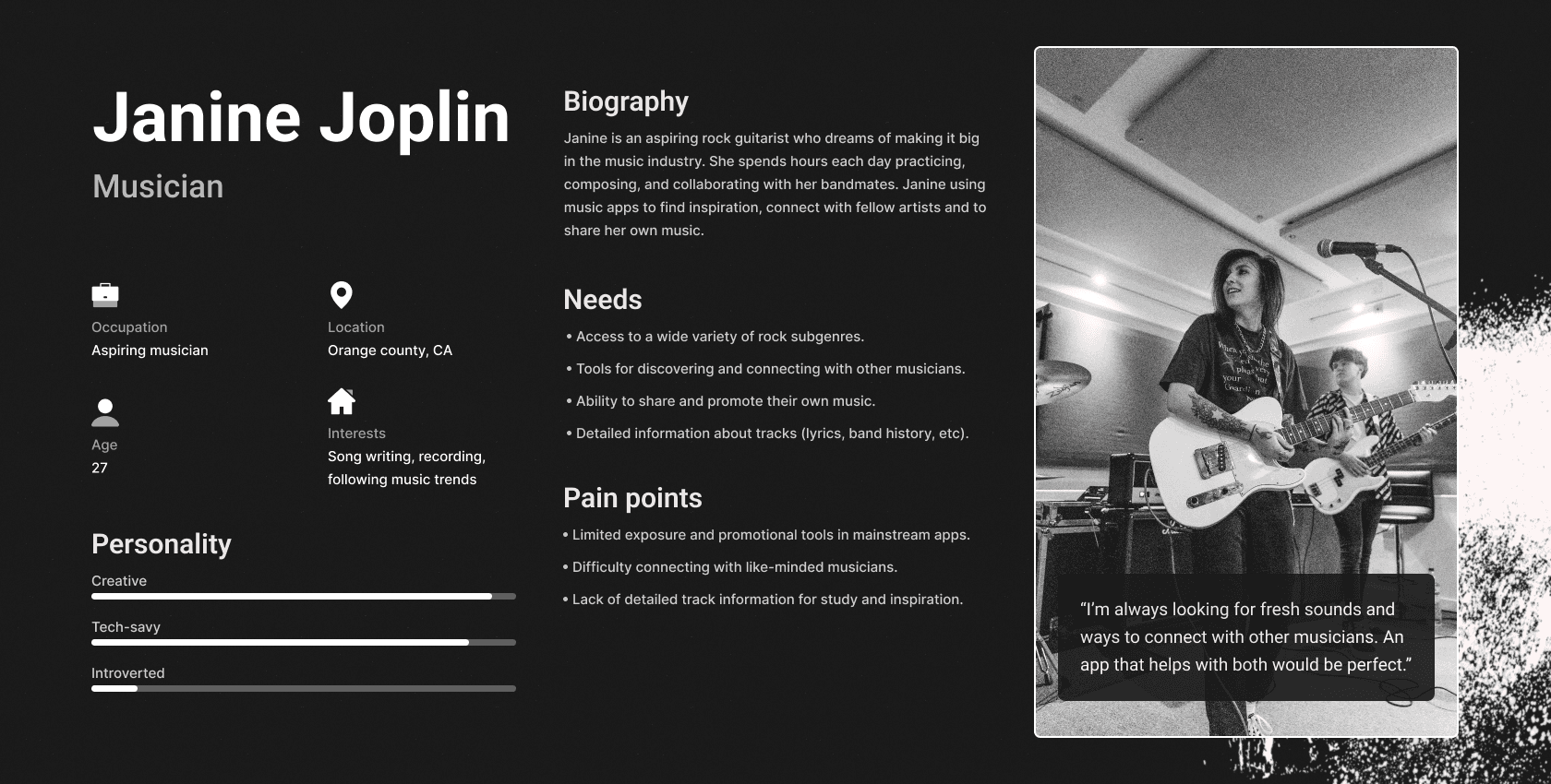
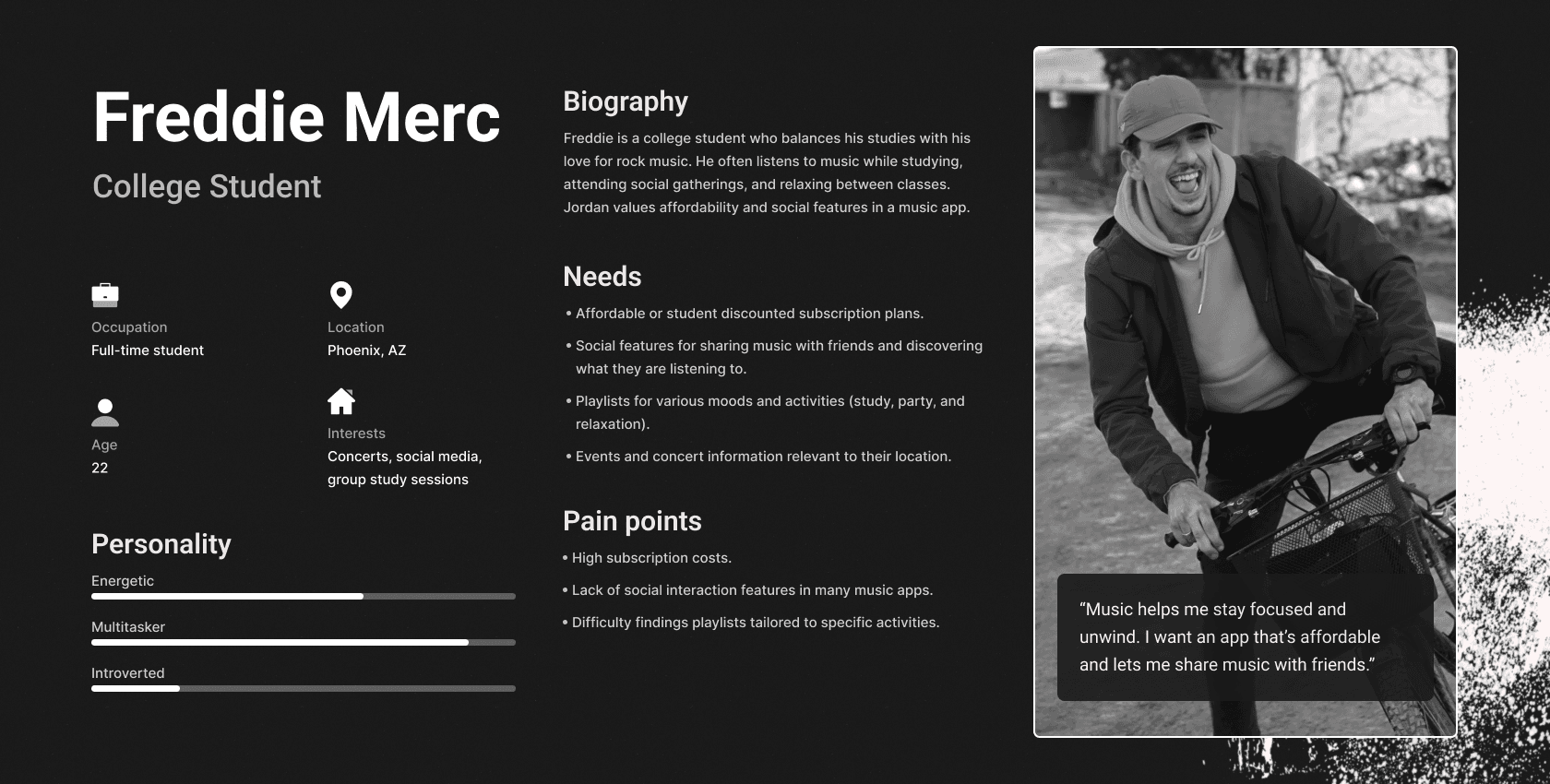
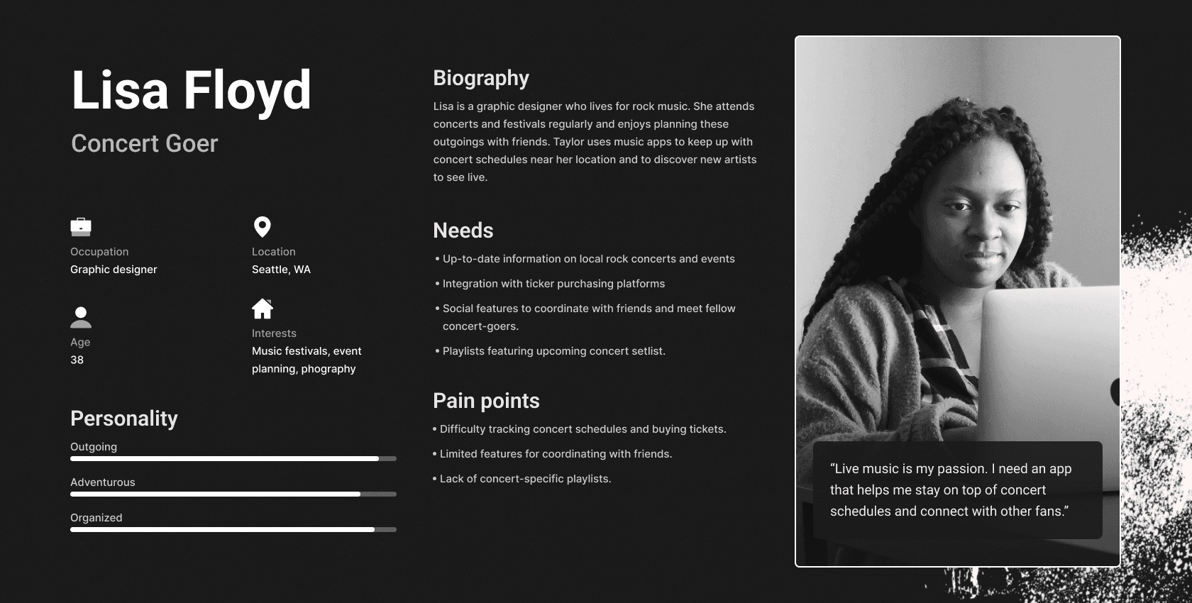
user personas

Based on my user and competitive research findings, I discovered three types of user personas

Based on my user and competitive research findings, I discovered three types of user personas

These personas helped me to identify the target audience for my app:

Mapping a user flow for Rhapsody based on the insights I gathered from my user personas

Mapping a user flow for Rhapsody based on the insights I gathered from my user personas

The user flow was useful in determining information architecture and the important tasks users would want to complete throughout the app based on my initial research.

Lo-fi concepts

I designed low-fidelity wireframes to experiment with various layouts and features

I designed low-fidelity wireframes to experiment with various layouts and features

The wireframes served as a blueprint, helping to visualize the app's functionality and flow. Originally I wanted users to endure more personalized onboarding screens, but realized this flow might slow down their progression towards the main functionalities of the app.

Using the lo-fi wireframes, I tested the initial prototype with real users

Using the lo-fi wireframes, I tested the initial prototype with real users

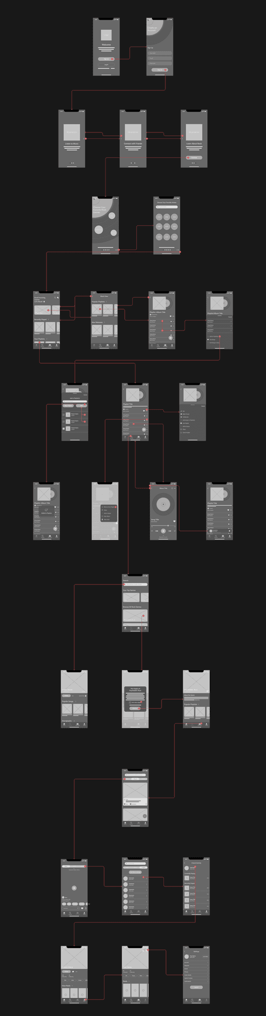
This allowed me to discover any additional needs or flaws in the current flow or interactions.
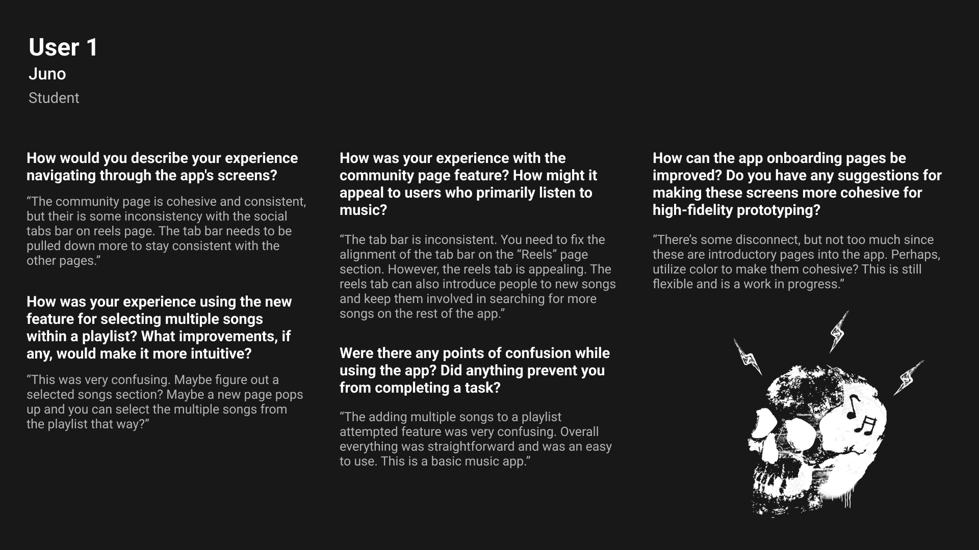
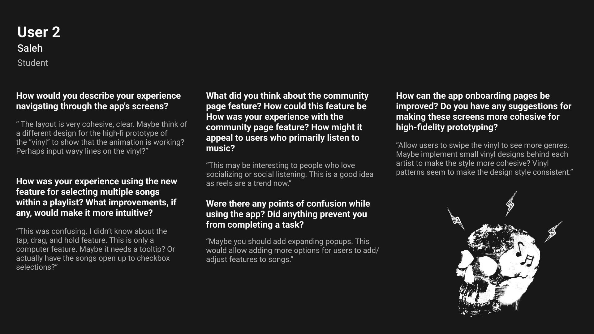
What I learned

Bulk selection of songs feature was confusing

Bulk selection of songs feature was confusing

Initially, I considered using accelerator patterns to enable users to quickly bulk select songs to add to playlists. However, the hold to select and drag feature had very hidden affordance and was not realized as a capability.

The community page feature was appealing

The community page feature was appealing

Users appreciated the community page for social engagement and music discovery. This pattern was inspired by social media reels, post content, comments and event trackers. This space was thought to engage the app's community.
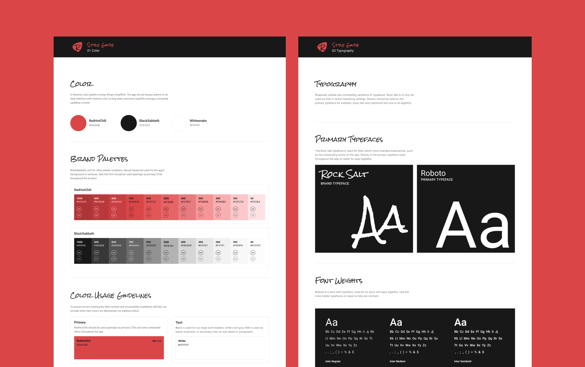
branding

Creating a brand that resonates with the rock music community

Creating a brand that resonates with the rock music community

To reiterate, the main goal was to design an app that not only caters to the functional needs of rock music lovers but also embodies the spirit and aesthetic of the rock genre.

Branding research and insights

Branding research and insights

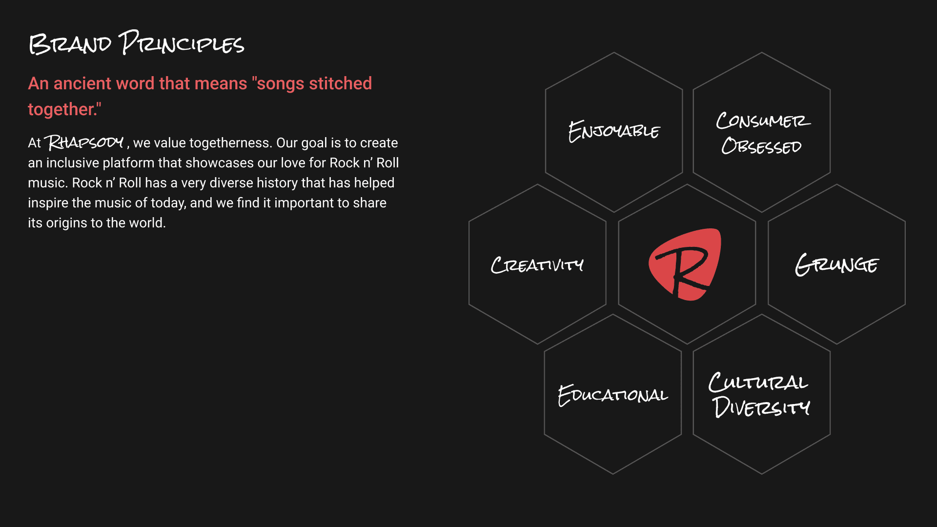
Drawing from some preliminary research, I identified a few core values and characteristics of rock music:

Authenticity

Authenticity

Community

Community

Revolutionary

Revolutionary

The brand styles

The brand styles

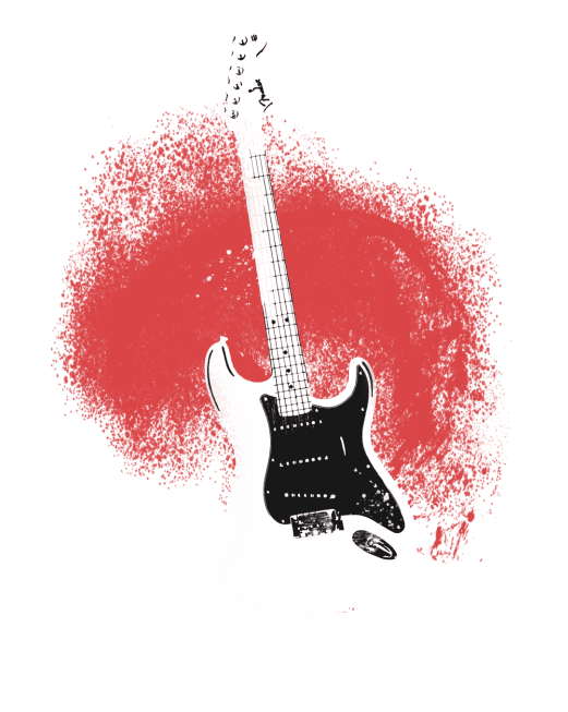
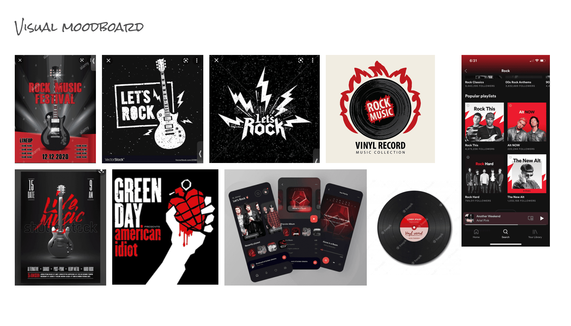
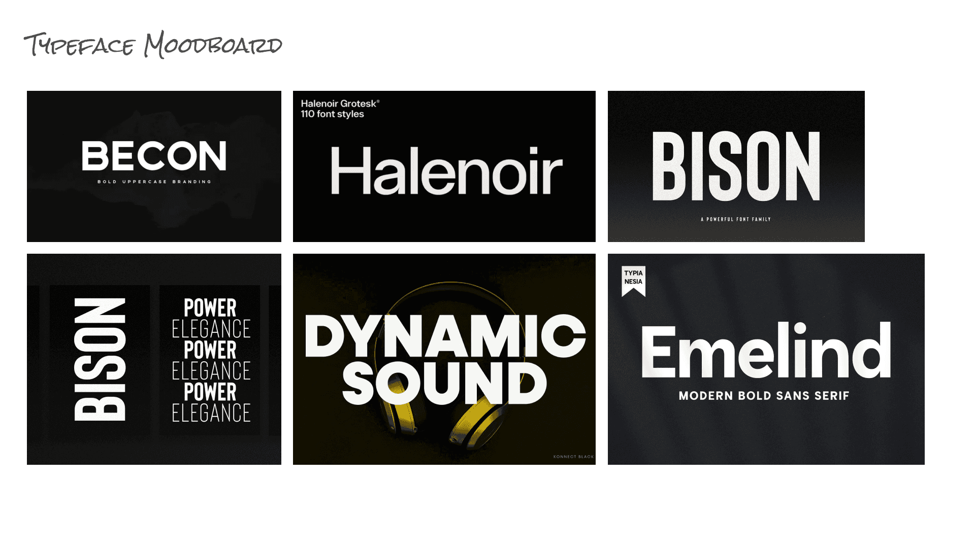
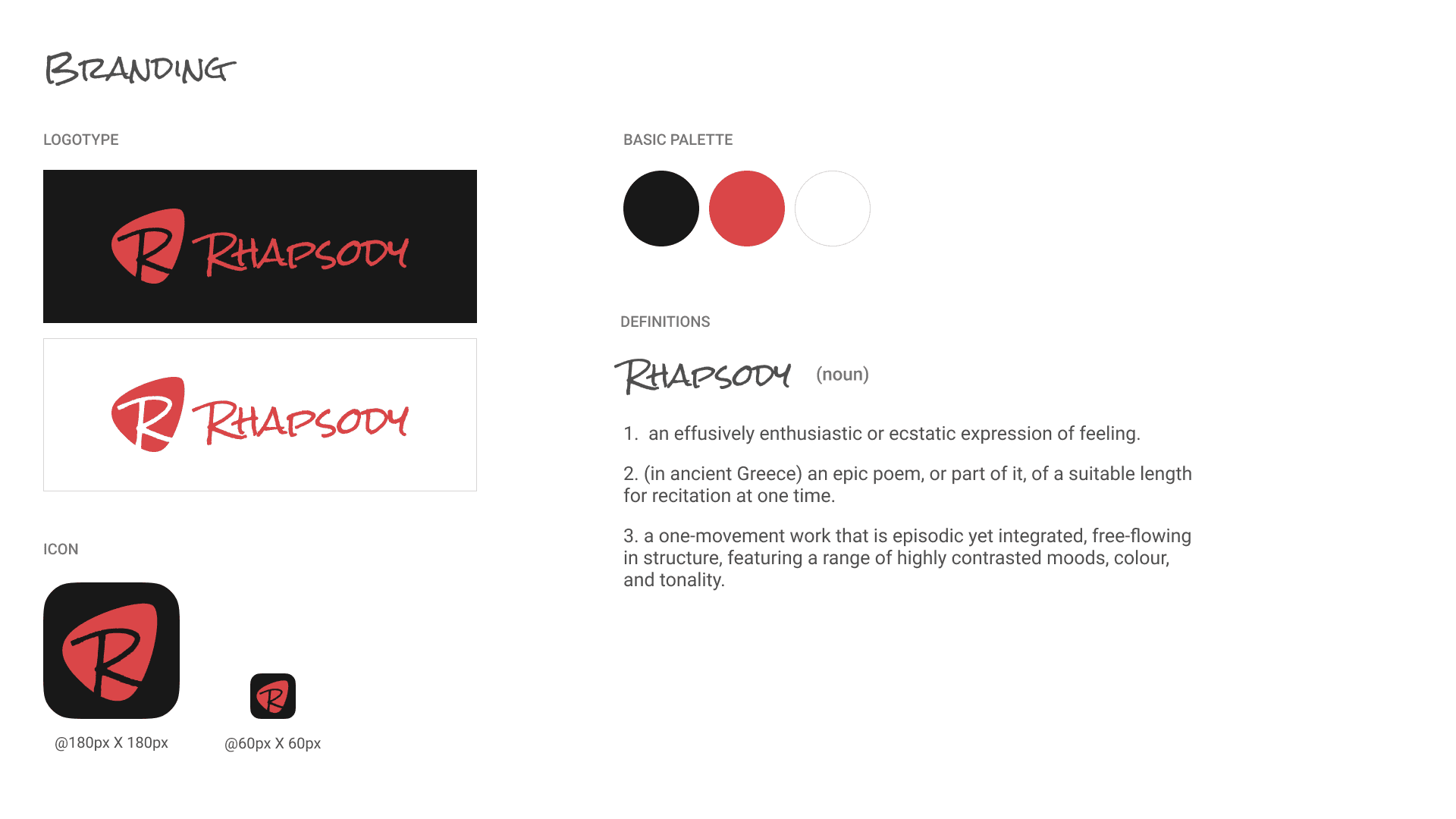
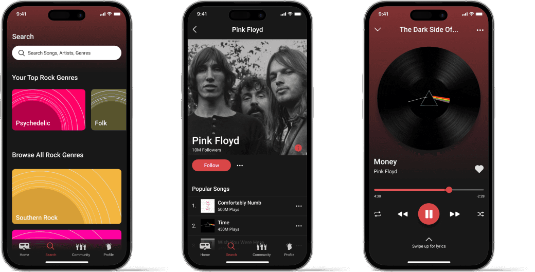
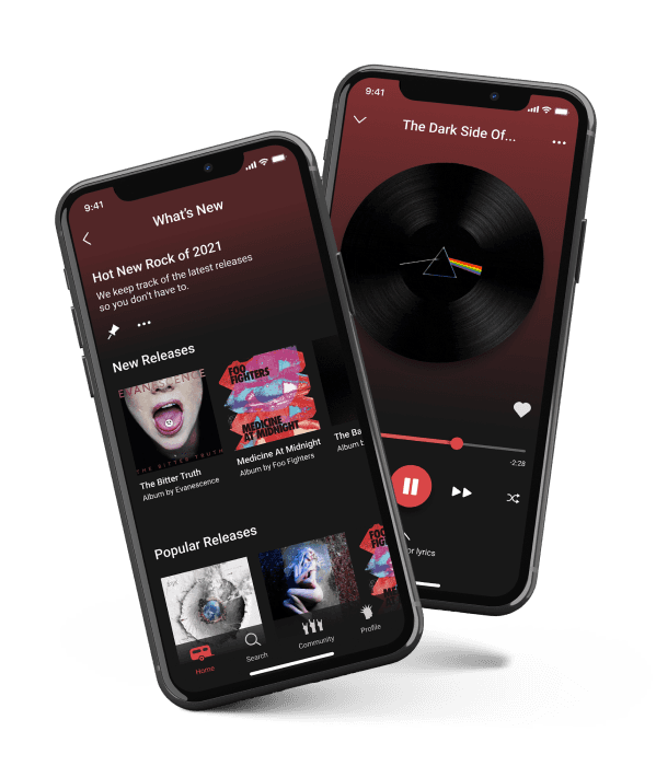
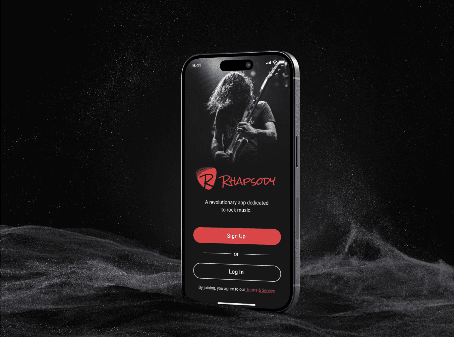
The app features a dark interface, which not only complements the rock aesthetic, but also reduces eye strain and improves the visibility of key elements on the interface. The bright red coincides with the idea of spunk and rebellion, fitting within some of the embodiment of rock and role music.

hi-fi deliverable

An app dedicated to the rock music community

An app dedicated to the rock music community

Browse for music

Browse for music

Users can easily curate playlists with an acceleration to help guide them towards the music search section to browse artists and songs.

Users can easily curate playlists with an acceleration to help guide them towards the music search section to browse artists and songs.

Solving a user problem

Solving a user problem

After understanding user frustration in the curation of personalized playlists from my research, I implemented a simple flow to allow users to add multiple songs to multiple playlists.

After understanding user frustration in the curation of personalized playlists from my research, I implemented a simple flow to allow users to add multiple songs to multiple playlists.


Rock out together

Rock out together

Rhapsody integrates social features to engage users in sharing music, viewing upcoming concerts, see others play or sing along to songs and listen to music simultaneously with friends.

Rhapsody integrates social features to engage users in sharing music, viewing upcoming concerts, see others play or sing along to songs and listen to music simultaneously with friends.

Share your music

Enabled sharing of favorite songs with other Rhapsody users internally. Externally share screenshots and sound clips of your favorite songs on social media platforms.


Share your music

Enabled sharing of favorite songs with other Rhapsody users internally. Externally share screenshots and sound clips of your favorite songs on social media platforms.


View the full prototype

takeaways

Iterative user testing is important

Iterative user testing is important

Iterative user testing played a crucial role in refining the app’s functionality and user experience. Early user testing helped uncover hidden affordances and user pain points, allowing for timely adjustments. This underscores the value of continuously gathering user feedback throughout the design process to ensure that the final product meets user needs and expectations.

Always consider balancing aesthetics with functionality

Always consider balancing aesthetics with functionality

While it was important to create an app that visually resonated with the rock music community, ensuring the app’s usability and functionality were not compromised was equally critical. This balance helped create a product that was both visually appealing and easy to use, reinforcing the idea that design is not just about aesthetics but also about solving real user problems.

Adapting to feedback is crucial

Adapting to feedback is crucial

Being open to feedback and willing to pivot design decisions based on user insights led to a better overall experience. For example, adapting the bulk selection feature after users found it confusing highlights the importance of flexibility and responsiveness in the design process. This approach helps create a product that genuinely addresses user needs.

More projects

More projects

More projects

Say hello.

laurenshortdesign@gmail.com

©2024 All Rights Reserved

Say hello.

laurenshortdesign@gmail.com

©2024 All Rights Reserved

Say hello.

laurenshortdesign@gmail.com

©2024 All Rights Reserved